
- Prepare your Schema
- Prepare your Catalog
- Upload your Feed
- Full Feed Upload
- Delta Feed Upload
- Single Record Upload
- Check Product Count
- Events
- Browser Integration
- Introduction to GTM
- Requirements
- Introduction
- Events
- API Integration

- Recommendations Endpoint
- Authentication
- Header
- Request Parameter
- Response Components
- Explanation Request Parameter
- Quick Integration
- Installation
- Fetch Recommendation Results
- Default Unbxd Template
- Custom Template
- Unbxd Template Customization
- Custom Feature Examples
- Quick Integration
- Installation
- Fetch Recommendation Results
- Installation
- Configuration
- Components
- Composer
- Direct Plugin Feed Upload
- Authentication
- General Settings
- Configuration
- Catalog Sync
- Catalog Sync Information
- Product Feed Generator
- Feed View
- Indexing Queue View
- Analytics Integration
- Upgrade
- Uninstall
- Installation
- Configuration
- Configure Feed
- Cron Job
- Features
- Uninstall
Recommendations SDK
Unbxd Recommendations SDK helps you integrate the Unbxd Recommendations and its functionalities.
With SDK documentation, you can optimize your layout of the recommendations widget. You can duplicate an Unbxd recommendation template and make changes to the JS-SDK configuration to render the appropriate HTML responses.
Version
The Recommendations SDK Version 2.1.0 can be found here for different regions:
|
Regions |
SDK version |
|
For the US customers |
https://libraries.unbxdapi.com/recs-sdk/v2.1.0/unbxd_recs_template_sdk.js https://libraries.unbxdapi.com/recs-sdk/v2.1.0/unbxd_recs_template_sdk.js https://libraries.unbxdapi.com/recs-sdk/v2.1.0/unbxd_recs_template_sdk.js |
|
For the UK customers |
https://libraries.unbxdapi.com/recs-sdk/v2.1.0/unbxd_recs_template_sdk_uk.js https://libraries.unbxdapi.com/recs-sdk/v2.1.0/unbxd_recs_template_sdk_uk.js https://libraries.unbxdapi.com/recs-sdk/v2.1.0/unbxd_recs_template_sdk_uk.js |
|
For the APAC customers |
https://libraries.unbxdapi.com/recs-sdk/v2.1.0/unbxd_recs_template_sdk_apac.js https://libraries.unbxdapi.com/recs-sdk/v2.1.0/unbxd_recs_template_sdk_apac.js https://libraries.unbxdapi.com/recs-sdk/v2.1.0/unbxd_recs_template_sdk_apac.js |
|
For the ANZ customers |
https://libraries.unbxdapi.com/recs-sdk/v2.1.0/unbxd_recs_template_sdk_anz.js https://libraries.unbxdapi.com/recs-sdk/v2.1.0/unbxd_recs_template_sdk_anz.js https://libraries.unbxdapi.com/recs-sdk/v2.1.0/unbxd_recs_template_sdk_anz.js |
NOTE: Integration done through Recs SDK is only for AJAX customers.
Update: While v1.0 had just desktop template support, with v2.0 you get desktop as well as mobile template support.
Quick Integration
To integrate Recommendations SDK onto your site quickly, follow these steps:
- To enable Unbxd powered recommendation widgets, you need to include Unbxd recommendations SDK. This can be achieved by adding the JS CDN link in your index HTML page
<script src="https://libraries.unbxdapi.com/recs-sdk/v2.1.0/unbxd_recs_template_sdk.js" async></script><script src="https://libraries.unbxdapi.com/recs-sdk/v2.1.0/unbxd_recs_template_sdk.js" async> </script><script src="https://libraries.unbxdapi.com/recs-sdk/v2.1.0/unbxd_recs_template_sdk.js" async> </script>
- Create locator HTML div nodes on your page.
<div class="horizontal-section"><!-- First Horizontal template to be rendered here with unique id for the widget --><div id="recommendations1"> </div></div><div class="horizontal-section"><-- First Horizontal template to be rendered here with unique id for the widget --><div class="horizontal-section"><!-- First Horizontal template to be rendered here with unique id for the widget --> <div id="recommendations1"> </div> </div> <div class="horizontal-section"><-- First Horizontal template to be rendered here with unique id for the widget --><div class="horizontal-section"> <div id="recommendations1"> </div> </div> <div class="horizontal-section"><-- First Horizontal template to be rendered here with unique id for the widget -->
- Invoke _unbxd_getRecommendations to fetch recommendations. This is the sample function for Home Page recommendations widget
window._unbxd_getRecommendations({widgets: {widget1: {name: "home_recommendations1"},widget2: {name: "home_recommendations2"},widget3: {name: "home_recommendations3"}},userInfo: {userId: 'uidValue',siteKey: 'siteKeyValue',apiKey: 'apiKeyValue'},pageInfo: {pageType: 'HOME'},itemClickHandler: function (product) {//do what you want to do with product that has been clicked herealert(JSON.stringify(product));},dataParser: function (templateData) {// modify the data received from recommendation API// in case requiredreturn templateData;}});window._unbxd_getRecommendations({ widgets: { widget1: { name: "home_recommendations1" }, widget2: { name: "home_recommendations2" }, widget3: { name: "home_recommendations3" } }, userInfo: { userId: 'uidValue', siteKey: 'siteKeyValue', apiKey: 'apiKeyValue' }, pageInfo: { pageType: 'HOME' }, itemClickHandler: function (product) { //do what you want to do with product that has been clicked here alert(JSON.stringify(product)); }, dataParser: function (templateData) { // modify the data received from recommendation API // in case required return templateData; } });window._unbxd_getRecommendations({ widgets: { widget1: { name: "home_recommendations1" }, widget2: { name: "home_recommendations2" }, widget3: { name: "home_recommendations3" } }, userInfo: { userId: 'uidValue', siteKey: 'siteKeyValue', apiKey: 'apiKeyValue' }, pageInfo: { pageType: 'HOME' }, itemClickHandler: function (product) { //do what you want to do with product that has been clicked here alert(JSON.stringify(product)); }, dataParser: function (templateData) { // modify the data received from recommendation API // in case required return templateData; } });
NOTE: You can know more about the details of keys by referring to our Search Documentation here.
Installation
We will learn how to integrate the Unbxd Recommendations SDK to optimize and power the recommendations results in the display page on your site.
Include Recommendation SDK in your application
To enable Unbxd powered recommendation widgets, you need to include Unbxd recommendations SDK. CDN link in thetag of the HTML code:
<!doctype html>
<html lang="en">
  <head>
    <!-- Required meta tags -->
    <meta charset="utf-8">
    <meta name="viewport" content="width=device-width, initial-scale=1, shrink-to-fit=no">

    <title>Hello, world!</title>
  </head>
  <body>
    <h1>Hello, world!</h1>

    <!-- Include these scripts -->
    <!-- template sdk first, followed by template widget initialization -->
    <script src=“<unbxd template sdk url>”></script>
  </body>
</html>
Create locator HTML div nodes
The web application on which the recommendation template will be displayed must contain HTML DIV nodes with well defined and unique IDs for the widget so that the SDK can fetch recommendations and display them at those positions
<div class="horizontal-section"><!-- First Horizontal template to be rendered here with unique id. -->
<div id="recommendations1"> </div>
</div>
Fetch Recommendations Results
The SDK has exposed a method (window.getUnbxdRecommendations) to fetch the recommendations and display them. The method can be called from your website to fetch recommendation content and get it rendered on their page.
Function Details
Function Name:window.getUnbxdRecommendations
Function Argument: Context Object – Everything that the recommendation API needs from the merchandiser application to serve the relevant recommendation.
NOTE: If you are integrating this in the react single page application then, Invoke the recommendation parameter by placing the script in the index.html file and invoking window.getUnbxdRecommendations in the mounting/updating phase of your components.
E.g In case of a react application the SDK can be implemented by invoking this method in the ‘componentDidMount’ method like this (in case of initial load):
componentDidMount(){
    new window.getUnbxdRecommendations({
	// context configuration here
     })
}
If you wish to show call the SDK when any update happens across the component the same call can be placed in ‘componentDidUpdate’ method:
componentDidUpdate(){
    new window.getUnbxdRecommendations({
	// context configuration here
     })
}
NOTE: window object needs to be used, otherwise the specific component won’t be able to access the recommendations call.
Invoke function to register hooks on before and after template rendered
Function Name:
_unbxd_RegisterHook(“beforeTemplateRender”, beforeTemplateRenderer);
_unbxd_RegisterHook(“afterTemplateRender”, afterTemplateRenderer);
Function Argument: Event name (beforeTemplateRender/ afterTemplateRender) & callback function which gets called when the event triggers in SDK. Prior to this, templateRenderer callback can be used to modify the recommendation items received from the Recommendation API. afterTemplateRendered gets called after every time the widget/template gets rendered. afterTemplateRendered callback is called with a parameter “isVertical” which can be used to distinguish between horizontal and vertical rendered templates.
 beforeTemplateRenderer = function(templateData){
           // modify the data received from recommendation API in case required.
          console.log("template data");
          return templateData;
       }

            //Perform activity after template render
       afterTemplateRenderer = function(isVertical){
         if(!isVertical){
               console.log("Horizontal Template Rendered");
         } else {
               console.log("Vertical Template Rendered");
         }
      }

      window._unbxd_registerHook("beforeTemplateRender", beforeTemplateRenderer);
      window._unbxd_registerHook("afterTemplateRender", afterTemplateRenderer);
Context Object Details
It is a Javascript object which would have following keys:
widgets
*REQUIRED
At least one of the keys among ‘widget1’, ‘widget2’ and ‘widget3’ has to be provided along with its configuration. The description of these keys can be found below
|
Key |
Type |
Description |
|
widget1 |
JavaScript Object |
Configuration for widget 1 |
|
widget1 > name |
String |
Unique Target DOM element id where widget1 will be displayed |
|
widget2 |
Object |
Configuration for widget 2 |
|
widget2 > name |
String |
Target DOM element id where widget2 will be displayed |
|
widget3 |
Object |
Configuration for widget 3 |
|
widget3 > name |
String |
Target DOM element id where widget3 will be displayed |
Sample Value:
widgets: {
                widget1: {
                    name: "home_recommendations1"
                },
                widget2: {
                    name: "home_recommendations2"
                },
                widget3: {
                    name: "home_recommendations3"
                }
            }
userInfo
*REQUIRED
userInfo must contain following key value pairs:
|
Key |
Type |
Description |
|
userId |
String |
User tracking ID to be used for personalized recommendations |
|
siteKey |
String |
Site key shared by UNBXD |
|
apiKey |
String |
API key shared by UNBXD |
NOTE: You can fetch the key details from the Search documentation.
Sample Value:
userInfo: {
                userId: 'uid',
                siteKey: 'site-key',
                apiKey: 'apiKey''
},
pageInfo
*REQUIRED
pageInfo must contain values for the following keys:
|
Key |
Type |
Description |
|
pageType |
String |
Must be one of ‘HOME’, ‘PRODUCT’, ‘CART’, ‘CATEGORY’ |
|
productIds |
Array |
An array of list of product ids of String type. This field is required only when the pageType is ‘PRODUCT’ or ‘CART’ |
|
catlevel1Name |
String |
Defines the first level of category filter. This field is required only when the pageType is ‘CATEGORY’ |
|
catlevel2Name |
String |
Defines the second level of category filter. This is an optional field which needs to be mentioned only when the pageType is ‘CATEGORY’ |
|
catlevel3Name |
String |
Defines the third level of category filter. This is an optional field which needs to be mentioned only when the pageType is ‘CATEGORY’ |
|
catlevel4Name |
String |
Defines the fourth level of category filter. This is an optional field which needs to be mentioned only when the pageType is ‘CATEGORY’ |
Category Level values must be in continuous order starting with catlevel1Name.
For instance:
‘catlevel1Name’: ‘Women’,
‘catlevel2Name’: ‘Clothes’,
‘catlevel3Name’: ‘Top’,
‘catlevel4Name’: ‘Denim’
catlevel1Name is REQUIRED for the Category page.
NOTE: If a category level value is skipped, the next level values will be ignored i.e. if ‘‘catlevel2Name’ value is not set, then ‘‘catlevel3Name’ and ‘‘catlevel4Name’ will be ignored by SDK. They will not be used to fetch recommendations.
itemClickHandler
OPTIONAL
Description for this handler can be found below:
|
Key |
Type |
Description |
|
itemClickHandler |
Function |
Callback method that will be called when the recommendation item is clicked in the widget. Callback is called with one argument which contains all the product attributes sent by the recommendation platform |
dataParser
OPTIONAL
|
Key |
Type |
Description |
|
dataParser |
Function |
Callback method that will be called just before feeding the data to dot template with original recommendations data. You can modify the original data based on your requirement and return the modified data to be passed to template. This is sometimes useful when you are using your custom template and you don’t want to write parsing logic in a template file. |
Sample function calls for each Page Type
Sample function calls for each page type
HOMEPAGE
_unbxd_getRecommendations({
            widgets: {
                widget1: {
                    name: "home_recommendations1"
                },
                widget2: {
                    name: "home_recommendations2"
                },
                widget3: {
                    name: "home_recommendations3"
                }
            },
            userInfo: {
                userId: 'uidValue'',
                siteKey: 'siteKeyValue',
                apiKey: 'apiKeyValue''
            },
            pageInfo: {
                pageType: 'HOME'
            },
            itemClickHandler: function (product) {
                //do what you want to do with product that has been clicked here
                alert(JSON.stringify(product));
            },
             dataParser: function (templateData) {
              // modify the data received from recommendation API
              // in case required
            return templateData;
            }
    });
PRODUCT PAGE
_unbxd_getRecommendations({
            widgets: {
                widget1: {
                    name: "product_recommendations1"
                },
                widget2: {
                    name: "product_recommendations2"
                },
                widget3: {
                    name: "product_recommendations3"
                }
            },
           userInfo: {
                userId: 'uidValue'',
                siteKey: 'siteKeyValue',
                apiKey: 'apiKeyValue''
            },
            pageInfo: {
                pageType: 'PRODUCT',
                productIDs: ['uniqueId1', 'uniqueId2']
            },
            itemClickHandler: function (product) {
                // product information will be provided here
                alert(JSON.stringify(product));
            },
            dataParser: function (templateData) {
             // modify the data received from recommendation API
             // in case required
            return templateData;
            }
    });
CART PAGE
_unbxd_getRecommendations({
            widgets: {
                widget1: {
                    name: "product_recommendations1"
                },
                widget2: {
                    name: "product_recommendations2"
                },
                widget3: {
                    name: "product_recommendations3"
                }
            },
            userInfo: {
                userId: 'uidValue'',
                siteKey: 'siteKeyValue',
                apiKey: 'apiKeyValue''
            },
            pageInfo: {
                pageType: 'CART',
                productIDs: ['uniqueId1', 'uniqueId2']
            },
            itemClickHandler: function (product) {
                // product information will be provided here
                alert(JSON.stringify(product));
            },
            dataParser: function (templateData) {
              //modify the data received from recommendation API
              //in case required
            return templateData;
            },
    });
CATEGORY PAGE
_unbxd_getRecommendations({
            widgets: {
                widget1: {
                    name: "product_recommendations1"
                },
                widget2: {
                    name: "product_recommendations2"
                },
                widget3: {
                    name: "product_recommendations3"
                }
            },
            userInfo: {
                userId: 'uidValue'',
                siteKey: 'siteKeyValue',
                apiKey: 'apiKeyValue''
            },
            pageInfo: {
                pageType: 'CATEGORY',
                catlevel1Name: 'MENS',
	          catlevel2Name: 'FORMALS',
	          catlevel3Name: 'SHIRTS',
	          catlevel4Name: 'NEW ARRIVALS'
            },
            itemClickHandler: function (product) {
                // product information will be provided here
                alert(JSON.stringify(product));
            },
              dataParser: function (templateData) {
             //modify the data received from recommendation
             // API in case required
            return templateData;
            },
    });
Default Template
Under the recommendations section, you have the option to select Unbxd’s default templates for displaying recommendations. The display of widgets varies with the device type and screen resolution. So, it’s important to choose templates for specific devices.
The template selection is specifically defined for all device types which are primarily divided into:
- Desktop
- Mobile
Let’s look at the various template types available for each device type.
Desktop
Selecting a template for the desktop version defines how would the recommendation widget be displayed across the portrait orientations.
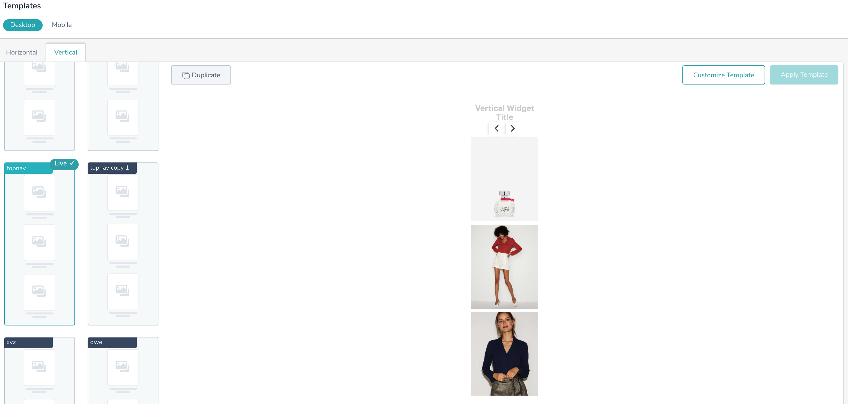
To see the desktop templates, navigate to Manage > Templates.
You can select either a Horizontal or Vertical template display for the products.
- Horizontal: Horizontal template displays products in a single plane, next to each other. Such a display makes it easier for customers to look at multiple products in one sight.
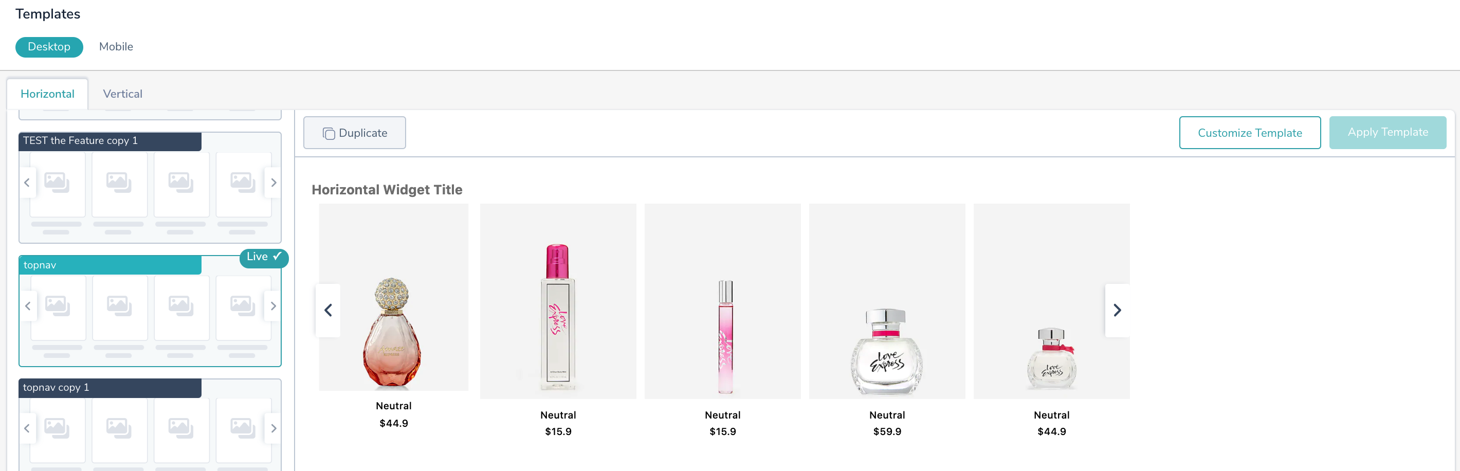
- Vertical: Vertical template displays products in a line one after another. In this shoppers see one product at a time.
Mobile
Selecting a template for the mobile version defines how would the recommendation widget be displayed across a smaller resolution screen. So, for displaying products on a mobile screen, the requirements differ.
To implement the mobile templates, navigate to Manage > Templates.
You can select either a Horizontal or Vertical template display for the products:
- Horizontal: Horizontal template displays products in a single plane, next to each other. Such a display makes it easier for customers to look at multiple products in one sight. You can ensure scrolling through products in two ways:
 Definite Scroll:
By choosing this template, users will always have a full view of the items in the recommendation list. If a user scrolls less than 50% of the image item, the item scrolls back to the initial position and thereby always giving a full view of the item.
The number of items shown can be configured using the “Number of products” available inside the customize template.
The VisibleOn attribute shows how many items need to be displayed on desktop and mobile. For example, by configuration, the desktop browser will show 4 items in the recommendation widget, while 2 items will be rendered on mobile browsers. These values are managed through the drop-down Number of products available in customized templates from respective mobile or desktop template sections.NOTE: We don’t have a width value defined for the default definite scroll template. In case, to customize the no of items displayed on the mobile browser, select a value in the Number of products
"visibleOn": {"desktop": 4,"mobile": 2},"visibleOn": { "desktop": 4, "mobile": 2 },"visibleOn": { "desktop": 4, "mobile": 2 }, Indefinite Scroll: With this type of scroll, users can have a full view or a % of view of the item during the scroll. The number of items shown can be configured in two ways:
a. Either directly specify the Number of products available in the customize template section
b. or, change the widget width inside Advanced Code Editor . By default, it is set to 120px. Modify the width value to increase/decrease the widget width."width": {"unit": "px","value": 120},"width": { "unit": "px", "value": 120 },"width": { "unit": "px", "value": 120 },
Note: Product width in the JSON config (Advanced Code Editor) takes precedence over the Number of products configuration. The product width configured will decide how many items will be visible on the mobile browser. -
Vertical template: Vertical template displays products in a line one after another. In this shoppers see one product at a time.
Currently, we are only supporting the same default vertical template that is available in the desktop template.
Custom Template
By default, Unbxd provides a bunch of templates for both mobile and desktop versions. These default templates, however, would be in a read-only state i.e it won’t support any modifications.
But in case, you have your own set of settings and a custom template, then Unbxd Recommendations has a feature to upload your templates.
Upload a template
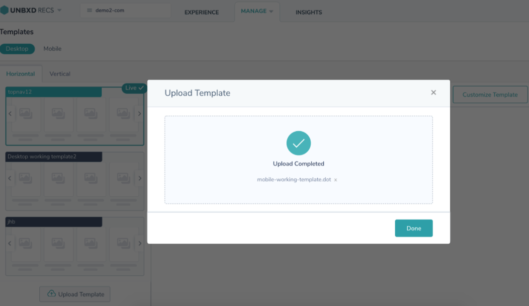
To upload your own custom template, follow these steps:
- Navigate to Manage>Templates>Upload template.
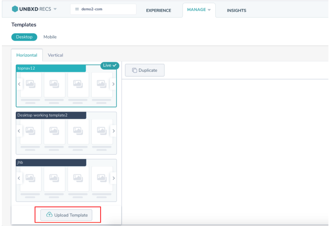
- When you click the Upload template, a file-uploader box to upload the template pops up. Specify a template name.
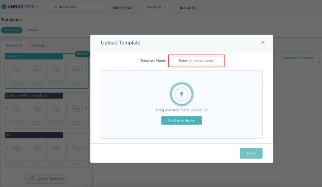
- Select and upload your template by clicking Fetch from device or just drag and drop your custom template here.
Note: The file format to upload the template must be .dot
- Once the template is uploaded, a success message appears.
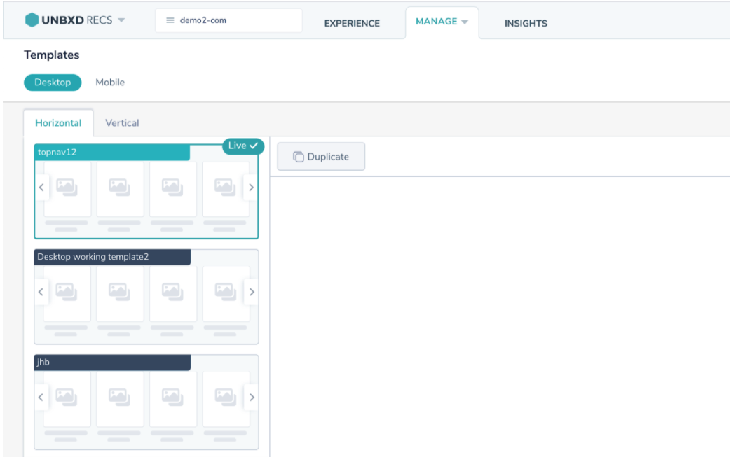
Once done, you can see the uploaded custom template in the template bar on the left side.
Update a template
To update a few configurations on the existing template, follow these steps:
- Navigate to Manage>Templates. Select an existing template and duplicate it.
- After duplicating, click the Customize Template> Advanced Code Editor.
- Select the Templateoption on the left panel and click Update template
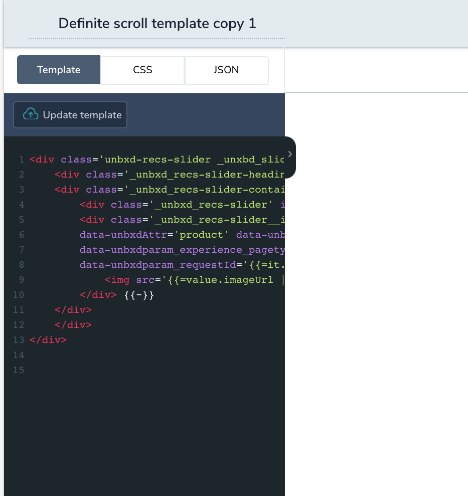
- Once you do, the file uploader pops-up. Now, select the updated template or drag and drop the file.
Note: The file format of upload should be .dot - Once the updated template is uploaded, a successful message appears.

Once done, you can see the updated template in the template bar on the left side.
Unbxd Template Customization
By default, you will be provided with default Unbxd templates. This default template however would be in a read only state i.e it won’t support any modifications. To apply modifications across the template design, you will have to duplicate the template by clicking the ‘Duplicate’ button.
This feature helps you you to duplicate an existing template and make customizations on it.
The types of available customizations are:
- UI Based Customizations
- Config-based Customizations
UI-Based Customization
After you duplicate an Unbxd template, you can customize it based on your requirements. To customize a template,
- Navigate to recommendation console.
- Select Manage > Templates.
- Click customize templates where you can find the configurations on the left panel.
As of now, only the following properties can be customized using UI based feature:
- Configurations:
Widget Size: This will decide the size of the widget that will appear on the merchandiser’s website. The size can be provided in either px or % value.
Number of products: This will set the no of product items that will be appearing at one time in the widget slide
Maximum Products: This will set the total no of products inside the widget slider - Product Fields: Product fields consist of fields that would be sent by the platform in recommendation response. This list comprises the following fields:
Unbxd Fields: Catalog fields which are dimensionally mapped to Unbxd Fields
Extra fields: These are additional fields added in the backend which would be reflected in the recommendations API response.
You can choose the fields that you wish to display on the Product Field tabFeatures Of Product Fields Tab
- Since image is the basic requirement of any recommendation, it has been selected as a default field that will always be displayed.
- You can add any field using the Add Another Field option.
- You can use drag functionality to define the order in which you wish to display the product fields.
Editor-Based Customization
Template widget can also be customized through Advanced Code Editor. The Editor allows you to edit the CSS code as well as the JSON configuration across the template.
To have a higher level of customizations, Editor based customizations are to be used. The editor features are:
- CSS Modifications: An example of modifying CSS through code editor: We’ll try and modify the ‘ ._unnbxd_recs-slider’ class. By setting the background-color property to grey across the class, the same will be reflected in the live preview.
- Configuration JSON modifier: In this example let’s try to modify the no of products that will appear on the screen at one time.
So initially if the slider looks something like this:
CSS Modifications
Using the CSS modifications, You can perform styling changes like:
- Change the font size
- Change font color
- Add custom stylesheets to any element within the widget
To customize the template with CSS modifications,
- Navigate to templates section within the recommendation console
- Select the template and Click Customize Template.
- To modify CSS, Click Advanced code editor.
- Add your custom styling within the CSS tab
JSON Configurations
Using JSON Configurations, you can perform config changes like:
- Control the number of items shown in the mobile view.
- Choose the styling for rating feature
- Show ‘Save Price’ message.
To customize the template with JSON modifications,
- Navigate to templates section within the recommendation console
- Select the template and Click Customize Template.
- To modify CSS, Click Advanced code editor.
- Add your configuration within the JSON tab{"widget": {"width": {"value": "100","unit": "%"}},"header": {"alignment": "left","type": "text","text": {"size": {"unit": "px","value": "16"},"style": "bold","colour": "black"}},"products": {"currency": "$","max_products": 18,"visible_products": 5,"max_fields": 3,"fields": [{"display_name": "Image","sequence_number": 0,"unbxd_dimension_key": "imageUrl","catalog_key": "image_url","styles": {"fontSize": "12px","fontWeight": "500"}}, {"display_name": "title","unbxd_dimension_key": "title","catalog_key": "title","styles": {"fontSize": "12px","fontWeight": "600"},"sequence_number": 1}, {"display_name": "price","unbxd_dimension_key": "price","catalog_key": "unbxd_price","styles": {"fontSize": "12px","fontWeight": "400"},"sequence_number": 3}],"strike_price_feature": {"enabled": false,"old": {"prefix": {"text": "$","styles": {}},"value": {"styles": {"color": "red","fontSize": "12px","fontWeight": "400","textDecoration": "line-through"}},"field": "unbxd_sellingprice_tmp"},"new": {"field": "unbxd_price_tmp","prefix": {"text": "Sale Price: ","styles": {"color": "black","fontSize": "12px","fontWeight": "bold"}},"value": {"styles": {"color": "black","fontSize": "12px","fontWeight": "400"}}},"discount": {"enabled": false,"mode": "value","prefix": {"text": "You Save: ","styles": {"color": "black","fontSize": "12px","fontWeight": "bold"}},"value": {"styles": {"color": "black","fontSize": "12px"}}}},"ratings_feature": {"enabled": true,"type": "both","sequence": ["image", "value"],"prefix": {"text": "Rating: ","styles": {"fontWeight": "bold","fontSize": "12px","marginRight": "5px"}},"value": {"styles": {"fontWeight": "bold","fontSize": "12px"}}}}}{ "widget": { "width": { "value": "100", "unit": "%" } }, "header": { "alignment": "left", "type": "text", "text": { "size": { "unit": "px", "value": "16" }, "style": "bold", "colour": "black" } }, "products": { "currency": "$", "max_products": 18, "visible_products": 5, "max_fields": 3, "fields": [{ "display_name": "Image", "sequence_number": 0, "unbxd_dimension_key": "imageUrl", "catalog_key": "image_url", "styles": { "fontSize": "12px", "fontWeight": "500" } }, { "display_name": "title", "unbxd_dimension_key": "title", "catalog_key": "title", "styles": { "fontSize": "12px", "fontWeight": "600" }, "sequence_number": 1 }, { "display_name": "price", "unbxd_dimension_key": "price", "catalog_key": "unbxd_price", "styles": { "fontSize": "12px", "fontWeight": "400" }, "sequence_number": 3 }], "strike_price_feature": { "enabled": false, "old": { "prefix": { "text": "$", "styles": {} }, "value": { "styles": { "color": "red", "fontSize": "12px", "fontWeight": "400", "textDecoration": "line-through" } }, "field": "unbxd_sellingprice_tmp" }, "new": { "field": "unbxd_price_tmp", "prefix": { "text": "Sale Price: ", "styles": { "color": "black", "fontSize": "12px", "fontWeight": "bold" } }, "value": { "styles": { "color": "black", "fontSize": "12px", "fontWeight": "400" } } }, "discount": { "enabled": false, "mode": "value", "prefix": { "text": "You Save: ", "styles": { "color": "black", "fontSize": "12px", "fontWeight": "bold" } }, "value": { "styles": { "color": "black", "fontSize": "12px" } } } }, "ratings_feature": { "enabled": true, "type": "both", "sequence": ["image", "value"], "prefix": { "text": "Rating: ", "styles": { "fontWeight": "bold", "fontSize": "12px", "marginRight": "5px" } }, "value": { "styles": { "fontWeight": "bold", "fontSize": "12px" } } } } }
{
  "widget": {
    "width": {
      "value": "100",
      "unit": "%"
    }
  },
  "header": {
    "alignment": "left",
    "type": "text",
    "text": {
      "size": {
        "unit": "px",
        "value": "16"
      },
      "style": "bold",
      "colour": "black"
    }
  },
  "products": {
    "currency": "$",
    "max_products": 18,
    "visible_products": 5,
    "max_fields": 3,
    "fields": [{
      "display_name": "Image",
      "sequence_number": 0,
      "unbxd_dimension_key": "imageUrl",
      "catalog_key": "image_url",
      "styles": {
        "fontSize": "12px",
        "fontWeight": "500"
      }
    }, {
      "display_name": "title",
      "unbxd_dimension_key": "title",
      "catalog_key": "title",
      "styles": {
        "fontSize": "12px",
        "fontWeight": "600"
      },
      "sequence_number": 1
    }, {
      "display_name": "price",
      "unbxd_dimension_key": "price",
      "catalog_key": "unbxd_price",
      "styles": {
        "fontSize": "12px",
        "fontWeight": "400"
      },
      "sequence_number": 3
    }],
    "strike_price_feature": {
      "enabled": false,
      "old": {
        "prefix": {
          "text": "$",
          "styles": {}
        },
        "value": {
          "styles": {
            "color": "red",
            "fontSize": "12px",
            "fontWeight": "400",
            "textDecoration": "line-through"
          }
        },
        "field": "unbxd_sellingprice_tmp"
      },
      "new": {
        "field": "unbxd_price_tmp",
        "prefix": {
          "text": "Sale Price: ",
          "styles": {
            "color": "black",
            "fontSize": "12px",
            "fontWeight": "bold"
          }
        },
        "value": {
          "styles": {
            "color": "black",
            "fontSize": "12px",
            "fontWeight": "400"
          }
        }
      },
      "discount": {
        "enabled": false,
        "mode": "value",
        "prefix": {
          "text": "You Save: ",
          "styles": {
            "color": "black",
            "fontSize": "12px",
            "fontWeight": "bold"
          }
        },
        "value": {
          "styles": {
            "color": "black",
            "fontSize": "12px"
          }
        }
      }
    },
    "ratings_feature": {
      "enabled": true,
      "type": "both",
      "sequence": ["image", "value"],
      "prefix": {
        "text": "Rating: ",
        "styles": {
          "fontWeight": "bold",
          "fontSize": "12px",
          "marginRight": "5px"
        }
      },
      "value": {
        "styles": {
          "fontWeight": "bold",
          "fontSize": "12px"
        }
      }
    }
  }
}
Custom Feature Examples
The custom features that can be added to your recommendations widget are:
- Strike Price Feature
- Ratings Feature
Strike Price Feature
Template SDK supports a strike price feature which allows you to show the old and new prices for product items where the old prices have strikethrough styles.
Customizations across strike price
The configuration for strike price would look something similar to:
"products": {
          ...//
         "strike_price_feature": {
         	"enabled": true,
         	"old": {
               "field": "old_price",
               "prefix":{
                  "text": "",
                  "styles": {}
               },
               "value":{
                  "styles": {
                     "color": "green",
                     "fontSize": "12px",
                     "textDecoration": "line-through"
                   }
                 },
               },
               "new": {
                   "field": "price",
                   "prefix":{
                      "text": "Sale Price: ",
                      "styles": {
                         "color": "black",
                         "fontSize": "12px",
                         "fontWeight": "bold"
                      }
                    },
                    "value":{
                       "styles": {
                          "color": "black",
                          "fontSize": "12px"
                        }
                    }
               },
               "discount": {
                  "enabled": true,
                  "mode": "percentage",
                  "prefix": {
                     "text": "You Save: ",
                     "styles": {
                       "color": "black",
                       "fontSize": "12px"
                    }
               },
                 "value": {
                    "styles": {
                      "color": "black",
                      "fontSize": "12px"
                  }
               }
            }
         }
                }
The required keys are explained here(All Fields are required):
|
Key |
Type |
Description |
|
strike_price_feature |
Object |
contains strike price configurations |
|
strike_price_feature > enabled |
Boolean |
If set to false, the feature won’t work and the plain product price will be displayed |
|
strike_price_feature > old |
Object |
contains configuration around old product price |
|
strike_price_feature > old > field |
String |
This field will be searched across product details in the recommendations section and will be considered as the key for old price |
|
strike_price_feature > old > prefix |
Object |
Configuration for prefix text that comes before old price value |
|
strike_price_feature > old > prefix > text |
String |
The prefix text to be shown before the old price. If no text is to be displayed, provide an empty string here(“”) value |
|
strike_price_feature > old > prefix > styles |
Object |
List of css properties in camelcase string that are to be applied on the prefix text |
|
strike_price_feature > old > value |
Object |
Configurations around the old price value |
|
strike_price_feature > old > value > styles |
Object |
List of css properties in camelcase string that are to be applied on the old price value |
|
strike_price_feature > new |
Object |
contains configuration around new product price |
|
strike_price_feature > new > field |
String |
This field will be searched across product details in the recommendations section and will be considered as the key for new price |
|
strike_price_feature > new > prefix |
Object |
Configuration for prefix text that comes before old price value |
|
strike_price_feature > new > prefix > text |
String |
The prefix text to be shown before the new price. If no text is to be displayed, provide an empty string here(“”) |
|
strike_price_feature > new > prefix > styles |
Object |
List of css properties in camelcase string that are to be applied on the prefix text |
|
strike_price_feature > new > value |
Object |
Configurations around the new price value |
|
strike_price_feature > new > value > styles |
Object |
List of css properties in camelcase string that are to be applied on the new price value |
|
strike_price_feature > discount |
Object |
Configuration around the price discount |
|
strike_price_feature > discount > enabled |
Boolean |
If set to false, the section containing discount information won’t appear on the widget |
|
strike_price_feature > discount > mode |
String |
Can be “value” or “percentage” |
|
strike_price_feature > discount > prefix |
Object |
Configurations around discount information |
|
strike_price_feature > discount > prefix > text |
String |
The prefix text to be shown before the discount price/percentage. If no text is to be displayed, provide an empty string here(“”) |
|
strike_price_feature > discount > prefix > styles |
Object |
List of css properties in camelcase string that are to be applied on the discount prefix text |
|
strike_price_feature > discount > value |
Object |
Configurations around discount value |
|
strike_price_feature > discount > value > styles |
Object |
List of css properties in camelcase string that are to be applied on the discount value |
Ratings Feature
Template SDK supports rating customization feature where in the merchandiser can choose to display the manner in which he wishes to display the product ratings.
The merchandiser can select one of the following scenarios –
- Only rating text is shown with rating value
- Only rating star images are shown
- Both rating text+value and rating star images are shown
Customizations across ratings
The configuration object for ratings will look like this:
{
  “products”:{
...//
"ratings_feature": {
         "enabled": true,
         "field":"rating",
         "type": "both",
         "sequence": ["image", "value"],
         "prefix": {
             "text": "Rating: ",
             "styles": {
                "color":"blue",
                "fontWeight":"bold",
                "fontSize":"12px"
             }
         },
         "value":{
             "styles": {
                 "fontWeight":"bold",
                 "fontSize":"12px",
                 "textDecoration":"underline",
                 "color":"red"
              }
          }
      }
   }
}
The keys are explained as below(All Fields are required):
|
Key |
Type |
Description |
|
ratings_feature |
Object |
Configuration around ratings |
|
ratings_feature > enabled |
Boolean |
If disabled, this feature won’t work |
|
ratings_feature > field |
String |
This field will be searched across product details in the recommendations section and will be considered as the key for rating |
|
ratings_feature > type |
Boolean |
The acceptable values ‘image’, ‘value’ and ‘both’ |
|
ratings_feature > sequence |
Array |
An array with two strings ‘image’ and ‘value’. The sequence of these values determine the sequence in which they will be displayed on the widget |
|
ratings_feature > prefix |
Object |
Configurations around the prefix text for ratings |
|
ratings_feature > prefix > text |
String |
Prefix text for ratings |
|
ratings_feature > prefix > styles |
Object |
List of css properties in camelcase string that are to be applied on the rating prefix text |
|
ratings_feature > value |
Object |
Configuration around ratings value |
|
ratings_feature > value > styles |
Object |
List of css properties in camelcase string that are to be applied on the ratings value |
- Did this answer your question?
