- Prepare your Schema
- Prepare your Catalog
- Upload your Feed
- Full Feed Upload
- Delta Feed Upload
- Single Record Upload
- Check Product Count
- JavaScript Based Integration
- HTML Based Integration
- Introduction to GTM
- Requirements
- Introduction
- Events
- API Integration
- Search Endpoint
- Authentication
- Header
- Request Parameter
- Response Components
- Explanation Request Parameter
- PDP API Format
- Sample Request
- Request Parameters
- Response Parameters
- System Requirements
- Install SDK
- Initialize SDK
- Unbxd Commerce Search
- Integrating Unbxd Autosuggest
- Unbxd Analytics
- Unbxd Browse
- Unbxd Recommendations
- Sample App
- Installation
- Unbxd Analytics
- Unbxd Commerce Search
- Unbxd Autosuggest
- Unbxd Browse
- Unbxd Recommendations
- Sample iOS App
- Quickstart with Unbxd Template
- Quick Integration to your site
- Detailed Guide
- Authentication
- Types of Pages to Render
- Configuring the Page
- Instance Methods
- More Information
- Available Configurations
- Libraries
- QuickStart
- Authentication
- Configuring Autosuggest
- Sample Options Object
- Handlebar Functions
- List of Configs
- Search Template
- Loader Config
- Facet Config
- Pagination
- Spellcheck
- Sort Config
- PageSize Config
- Breadcrumb Config
- Product Views
- Variants
- Quick Integration with Unbxd template
- Quick Integration to your site
- Installation
- Authentication
- Types of pages to render
- Configuring the page
- PageSize Config
- More Info
- Endpoint
- Authentication
- Headers
- Request Parameters
- API Response
- Response Components
- Create an Unbxd Account
- Create an Unbxd Site
- Upload a Catalog
- Setup Search
- Integrate Search
- Create an Unbxd Account
- Create an Unbxd Site
- Upload a Catalog
- Setup Search
- Integrate Search
- Plugin Installation
- Configuration
- Uninstallation
- Test Plugin Installation
- Installation
- Authentication
- Catalog
- Catalog Sync
- Product Integration
- Custom Template
- Indexing Queue View
- Feed View
- Upgrade
- Uninstall
- Installation
- Authentication
- Catalog
- Cron Job
- Product Config
- Uninstall
- Installation
- Configuration
Autosuggest documentation
Having product suggestions appear as shoppers type in a query isn’t just about efficiency but also about enhancing your shopper’s user experience. The true value and impact on the user’s search experience come from how to autocomplete suggestions that can assist and guide users toward better search queries.
The purpose of this document is to provide the necessary steps to be followed to integrate Unbxd autosuggest using Unbxd Autosuggest JS SDK.
Version
0.1
Libraries
Library |
Version |
jQuery |
1.11.3 + |
handlebar |
3.0.3 + |
If your website is not using the above mentioned libraries then the same can be bundled along with unbxd autosuggest js file. For more details check config options in bundle build procedure.
Quickstart
Through this integration guide you will learn how to integrate the Unbxd AutoSuggest JS SDK to power the keyword and product suggestions on your website.
The final integrated result that we are aiming at with this step by step guide can be seen at this
NOTE: The Unbxd JS SDK uses Handlebars as the HTML templating engine. Wherever you see config options that expect an HTML string template, it would be in the Handlebars template format.
The first step is to include the Unbxd Autosuggest JS along with its required dependencies. For this add the following CSS & JS files into the “” section of your HTML page
<head> <link rel="stylesheet" href="./css/styles.css"/> <script type="text/javascript" src="//cdnjs.cloudflare.com/ajax/libs/jquery/3.4.1/jquery.min.js"> </script> <script type="text/javascript" src="//cdnjs.cloudflare.com/ajax/libs/handlebars.js/4.5.3/handlebars.min.js"> </script> <script type="text/javascript" src="//libraries.unbxdapi.com/unbxdAutosuggest_v1.js"> </script>
To instantiate the autosuggest and bind it to the search box,
- Invoke the “unbxdAutoSuggestFunction” function available as a window variable by passing the instance of jQuery & handlebar as arguments.
- Select the input box element using jquery and invoke “unbxdautocomplete” function (a Unbxd function added to jQuery prototype) passing the suggestion options object.
<script type="text/javascript"> unbxdAutoSuggestFunction(jQuery, Handlebars); // step 1 //step 2 jQuery("#search_input").unbxdautocomplete( { siteName: "<your site key>", APIKey: "<your API key>" }); </script>Let us walk through the important configs that need to be passed along with their values for powering the auto suggest component.
NOTE: You can find a detailed list of all acceptable configs at the end of this doc.
Authentication
Once installed, yo need to authenticate your Unbxd extension using your Unbxd account keys (also known as Authentication Keys).
Whenever a customer signs up with Unbxd, they are issued one or more site keys and api keys depending on their use case. Some common scenarios:
- For a customer with one website and two environments (production and staging), 2 site keys (one for each environment) and 1 API key is issued
- For a customer with more than one website (multi website vendor), the site key would be issued for every website + environment combination. So there would be an “n” number (equal to the number of website’s) of API keys generated.
For multiple site keys, check if you have:
- more than one environment
- more than one website
- different product set for staging and live, or
- wish to track search performance and clicks separately for every microsite.
To get your Site Key and API Key in the console, please refer to the steps mentioned in the Help Documentation
Pass the Site Key and API Key that you get from the console in the “siteName” and “APIKey” configs.
siteName:
Data type |
string |
Required |
true |
Default |
NA |
Description |
Site name assigned by Unbxd (unique identifier for each customer/site) |
APIKey:
Data type |
string |
Required |
true |
Default |
NA |
Description |
Unique API key assigned by unbxd |
platform:
Data type |
string |
Required |
false |
Default |
com |
Description |
Autosuggest has two platform “io” & “com”, Customers are expected to use “io” as is the latest version. |
At the end of this step, you should have the Site Key & API Key which can be passed into the “siteName” & “APIKey” configs as shown below:
new Unbxd.setSearch({ siteName: "<Your Site Name>", APIKey: "< Your API key>" });
Configure the autosuggest options object
In this, you would be introduced to the various options properties which can be leveraged to customize the behavior and look and feel of the autosuggest widget.
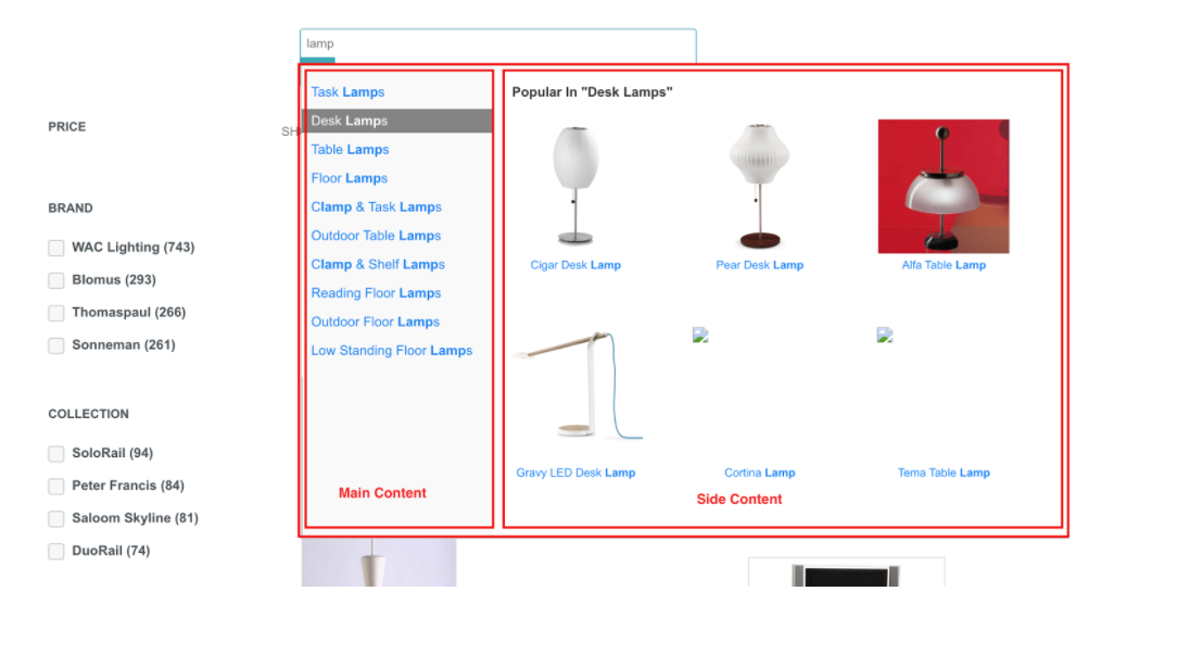
Template Design
The autosuggest widget can be styled as either 1 column or 2 column layout, depending on available real estate and business needs, the two columns are referenced as “maincontent” and “sidecontent”.
Styling the autosuggest widget
template:
Data type |
number |
Required |
false |
Default |
1column |
Description |
Choose the column layout for the widget. A general recommendation is 2column for tablet and above & 1column for mobile devices. |
Possible values |
1column (or) 2column |
Sample Value |
2column |
mainWidth:
Data type |
number |
Required |
false |
Default |
0 |
Description |
The size of the main content column when used in a two column template |
Sample Value |
200 (or) jQuery(“#search_input”).outerWidth() * 0.52 |
sideWidth:
Data type |
number |
Required |
false |
Default |
180 |
Description |
The size of the side content column when used in a two column template |
Sample Value |
180 |
position:
Data type |
String |
Required |
false |
Default |
absolute |
Description |
Value will be used as the position css style property for the widget |
Possible value |
All possible “position” css property value (fixed|absolute|relative..) |
sideContentOn:
Data type |
String |
Required |
false |
Default |
right |
Description |
Used to determine the position of the sidecontent in a 2column layout.Similar to float right and left. Usual a value of left is configured for customers with searchbox aligned on the right end of the page. |
Possible Value |
left (or) right |
theme:
Data type |
String |
Required |
false |
Default |
#ff8400 |
Description |
The value is used as an extension point for custom styling |
Sample Value |
10000000 |
loadingClass:
Data type |
string |
Required |
false |
Default |
unbxd-as-loading |
Description |
The class selector matches the loader to be shown while awaiting results to be loaded by autosuggest. |
resultClass:
Data type |
string |
Required |
false |
Default |
unbxd-as-wrapper |
Description |
The value will be set to the class attribute of the parent div element of the widget container. Hence can be used as an extension point by customers to incorporate custom styling |
At the end of this step, you should have populated all styling options available in the autosuggest widget as shown below,
new Unbxd.setSearch({ siteName: "", APIKey: "", version: “io”, resultsClass: "unbxd-as-wrapper", loadingClass: "unbxd-as-loading", mainWidth: jQuery("#search_input").outerWidth() * 0.52, sideWidth: 524, zIndex: 1000000, position: "relative", sideContentOn: "right", template: "2column", theme: "#ff8400" });
Configure the functional behaviour
The following config options can be used to control the functional behaviour of the widget.
minChars:
Data type |
number |
Required |
false |
Default |
1 |
Description |
The minimum number of search character after which the suggestion should be recommended |
delay:
Data type |
number |
Required |
false |
Default |
100 |
Description |
Numeric value in microseconds between keystrokes and refreshing of autosuggest content |
Configure the contents of template
Unbxd offers 6 different types of suggestion for the searched term,
- Keyword suggestion (Textual match to complete or spell correct the searched term)
- Top queries (Based on the popular searches across customer profiles)
- Popular suggestion (Handpicked suggestion to be boosted)
- In fields (keyword suggestion within an attribute in a product – suggestion within brand, product type)
- Featured fields (Similar to keyword suggestion but limited within a given attribute in a product)
- Popular products
In the following sections , we will discuss how to configure and render each of these suggestions within autosuggest widget
mainTpl:
Data type |
Array of strings |
Required |
false |
Default |
[‘inFields’, ‘keywordSuggestions’, ‘topQueries’, ‘popularProducts’] |
Description |
Listed suggestion types will be displayed in the maincontent where applicable |
Possible value |
All the 6 different types listed in the introduction section |
sideTpl:
Data type |
Array of strings |
Required |
false |
Default |
[] |
Description |
Listed suggestion types will be displayed in the sidecontent when applicable |
Possible value |
All the 6 different types listed in the introduction section |
At the end of this step the config should be as below,
new Unbxd.setSearch({ siteName: "", APIKey: "", version: “io”, resultsClass: "unbxd-as-wrapper", loadingClass: "unbxd-as-loading", mainWidth: jQuery("#search_input").outerWidth() * 0.52, sideWidth: 524, zIndex: 1000000, position: "relative", sideContentOn: "right", template: "2column", theme: "#ff8400", mainTpl: ["topQueries","keywordSuggestions","promotedSuggestion","inFields" ], sideTpl: ["popularProducts"], });
Configure the various suggestions types
In this section you would configure details of each suggestion type which is configured in the mainTpl or SideTpl
keywordSuggestions:
Data type |
object |
Required |
false |
||
Default |
{ |
||||
Description |
count:number -> the number of suggestions to be shown header:String -> Header to be displayed tpl:String -> Handlebar template to representing the HTML layout for the suggestion |
||||
Input Value |
{"autosuggest" |
topQueries:
Data type |
object |
Required |
false |
||
Default |
{ count: 2, |
||||
Description |
count:number -> the number of suggestions to be shown header:String -> Header to be displayed tpl:String -> Handlebar template to representing the HTML layout for the suggestion |
||||
Input Value |
{"autosuggest" |
promotedSuggestion:
Data type |
object |
Required |
false |
||
Default |
{ |
||||
Description |
count:number -> the number of suggestions to be shown header:String -> Header to be displayed tpl:String -> Handlebar template to representing the HTML layout for the suggestion |
||||
Input Value |
{ "autosuggest":"Zinger Chairs", |
featuredFields:
Data type |
array |
Required |
false |
||
Default |
[‘brand’] |
||||
Description |
Can be any autosuggest indexed properties in the product. Note: prior using it, ensure that unbxd technicians to configure featured field in backend system. |
||||
Sample Value |
[‘category’] |
Featured field property configuration
For properties listed in the featured field array, a configuration for each of those properties should be added to the autosuggest options. Assume if category is listed as a featured field then
category:
Data type |
object |
Required |
false |
||
Default |
NA |
||||
Description |
count:number -> the number of suggestions to be shown header:String -> Header to be displayed tpl:String -> Handlebar template to representing the HTML layout for the suggestion |
||||
InputValue |
{ doctype: "Furniture"
|
||||
Sample Value |
{ count: 2, |
inFields:
Data type |
object |
Required |
false |
||
Default |
{ count: 0 |
||||
Description |
count:number -> the number of suggestions to be shown header:String -> Header to be displayed tpl:String -> Handlebar template to representing the HTML layout for the suggestion fields:object -> The various properties which should be used for in field suggestion (for someone searching for shoes infield suggestion would be In brand : Nike, Addidas, Puma In Color: Red, Green and Blue In Category: Casuals , Formals or sports |
||||
InputValue |
|
||||
Sample Value |
{ count: 2, header: "", tpl: "{{{safestring highlighted}}}" }, |
popularProducts:
Properties applicable when using the default template
showCart:
Data type |
boolean |
Required |
false |
||
Default |
true |
||||
Description |
When set to true add to cart button is shown for each popular product |
cartType:
Data type |
String |
Required |
false |
||
Default |
inline |
||||
Description |
|||||
Possible Values |
Inline | Separate |
popularProducts:
Data type |
object |
Required |
false |
Default |
{ count: 4 |
Description |
count : number-> the number of products to be shown fields: array -> The attributes on the products to be fetched price: boolean -> true if product price to be shown in the suggest widget priceFunctionOrKey:String (or) Function -> attribute which contains the price value for the product image:boolean -> true if product image to be shown in the suggest widget imageUrlOrFunction:String (or) Function -> attribute which contains the url to the image for the product currency:String -> Denote the currency symbol header:String -> Title for popular products section view:String -> can be list (or) grid tpl:String -> Handlebar template to representing the HTML layout for the suggestion |
InputValue |
|
Properties applicable when using the default template.
showCart:
Data type |
object |
||||
Default |
{ count: 4 , fields: ['*'] , price: true , priceFunctionOrKey: "price" , image: true , imageUrlOrFunction: "imageUrl" , currency: "Rs." , displayHeader: true // used to note if popular products header needs to be shown, Can't base it on the value of header attribute as it get's constructed realtime by filtered products. , header: "" , loadmore: false // used in conjuction with filteredProductEvent value equal to click , view: 'list' , tpl: ['{{#if ../showCarts}}' , '{{#unbxdIf ../../cartType "inline"}}'//"inline" || "separate" , ' '
, ' '
, '{{#if image}}' , ' , '{{/if}}' , '' , ' '
, ' '
, ' '
, ' '
, '{{{safestring highlighted}}}' , '' , '' , '' , '' , '{{#if price}}' , ' '
, '{{currency}}{{price}}' , '' , '{{/if}}' , ' '
, ' '
, 'Qty' , '' , '' , '' , ' '
, '' , '' , '' , '{{else}}' , ' '
, ' '
, '{{#if image}}' , ' , '{{/if}}' , '' , ' '
, ' '
, '{{{safestring highlighted}}}' //,'{{{processAutosuggestTitle _original.brandName highlighted}}}' , '' , ' '
, ' '
, '' , '' , ' '
, ' '
, 'Qty' , '' , '' , '' , '{{#if price}}' , ' '
, '{{currency}}{{price}}' , '' , '{{/if}}' , '' , '' , '' , '{{/unbxdIf}}' , '{{else}}' , ' '
, ' '
, '{{#if image}}' , ' , '{{/if}}' , '' , ' '
, '{{{safestring highlighted}}}' //,'{{{processAutosuggestTitle _original.brandName highlighted}}}' , '' , '{{#if price}}' , ' '
, '{{currency}}{{price}}' , '' , '{{/if}}' , '' , '{{/if}}'].join('') } |
||||
Description |
count : number-> the number of products to be shown fields: array -> The attributes on the products to be fetched price: boolean -> true if product price to be shown in the suggest widget priceFunctionOrKey:String (or) Function -> attribute which contains the price value for the product image:boolean -> true if product image to be shown in the suggest widget imageUrlOrFunction:String (or) Function -> attribute which contains the url to the image for the product currency:String -> Denote the currency symbol header:String -> Title for popular products section view:String -> can be list (or) grid tpl:String -> Handlebar template to representing the HTML layout for the suggestion |
||||
InputValue |
|
onCartClick:
Data type |
function |
Required |
false |
||
Default |
Empty function |
||||
Description |
Can be used as a on click hook to trigger add to cart action |
On completion of the above steps, the config should be as shown below,
new Unbxd.setSearch({ siteName: "{your site key}", APIKey: "{your API key}", version: “io”, resultsClass: "unbxd-as-wrapper", loadingClass: "unbxd-as-loading", mainWidth: jQuery("#search_input").outerWidth() * 0.52, sideWidth: 524, zIndex: 1000000, position: "relative", sideContentOn: "right", template: "2column", theme: "#ff8400", mainTpl: ["topQueries", "keywordSuggestions"], sideTpl: ["popularProducts"], featuredFields: [], showCarts: false, cartType: "separate", featuredFields: [], inFields: { count: 0, fields: { brand: 3, category: 3, color: 3 }, header: "", tpl: "{{{safestring highlighted}}}" }, topQueries: { count: 6, hidden: false, header: "", tpl: "{{{safestring highlighted}}}" }, keywordSuggestions: { count: 6, header: "", tpl: "{{{safestring highlighted}}}" }, popularProducts: { count: 6, fields: [ "title", "uniqueId", "imageUrl", "productUrl", "price", "autosuggest", "doctype" ], price: true, image: true, imageUrlOrFunction: "imageUrl", priceFunctionOrKey: "price", autosuggestName: "ItemName", currency: "$", header: "Most Popular Products", tpl: [ '
" ].join("") } });
Other Properties
noResultTpl:
Data type |
String/ function |
Required |
false |
||
Default |
NA |
||||
Description |
Handle template string, representing the HTML layout to be shown when there are no suggestions to be shown, or it could be a function which returns a handlebar template string |
hbsHelpers:
Data type |
Function |
Required |
false |
||
Default |
NA |
||||
Description |
To bind any custom helper function to be used within the templates |
||||
Sample value |
function () { Handlebars.registerHelper("toUpper", function (context, options) { return context.toUpperCase(); }); } |
filtered:
Data type |
Boolean |
Required |
false |
||
Default |
false |
||||
Description |
When set to true the popular products section would be refreshed with respective to on hover of every suggestion |
Callback functions
This section documents the different callback functions exposed by the SDK that you can hook into to listen to respond to various events
onSimpleEnter:
Data type |
function |
Required |
Optional |
Description |
Call back function which would be invoked when the enter keystroke is recorded from the search input box. This function can be used to validate and submit the search action only when the search input value is not empty |
||
Sample values |
function() { this.lastKeyEvent.preventDefault(); if (this.input.value.trim().length > 0) { this.input.form.submit(); } } |
onItemSelect:
Data type |
function |
Required |
Optional |
Description |
Call back function invoked when either the suggestion or popular product is selected. |
||
Sample values |
function(data, original) { if ( data.type === "POPULAR_PRODUCTS" || data.type === "POPULAR_PRODUCTS_FILTERED" ) { window.location = window.location.origin + getRelativeUrl(original.productUrl); } else if (data.type == "IN_FIELD") { window.location = window.location.origin + "/?q=" + encodeURIComponent(data.value); } else if (data.type == "brand") { window.location = window.location.origin + "/?q=" + encodeURIComponent(original.autosuggest_unstemmed); // + '&dispatch=products.advsearch&cid=0&subcats=Y', '_blank'; } else { window.location = window.location.origin + "/?q=" + encodeURIComponent(data.value); } } } |
Sample Options Object
Including the script object as shown below, would render the autosuggest widget as exhibited on this website Demo Site
<script> unbxdAutoSuggestFunction(jQuery, Handlebars); unbxd_as_config = { siteName: "2modern_com-u1435315921404", APIKey: "2880cec60e264bc9b342a379666d4439", resultsClass: "unbxd-as-wrapper", minChars: 1, delay: 100, loadingClass: "unbxd-as-loading", mainWidth: jQuery("#search_input").outerWidth() * 0.52, sideWidth: 524, zIndex: 1000000, position: "relative", sideContentOn: "right", template: "2column", theme: "#ff8400", mainTplHeader: null, mainTpl: [ "topQueries", "keywordSuggestions", "promotedSuggestion", "inFields" ], sideTpl: ["popularProducts"], featuredFields: [], showCarts: false, cartType: "separate", maxSuggestions: 10, hbsHelpers: null, filtered: true, processResultsStyles: function(fpos) { fpos.width = "800px"; return fpos; }, mainTpl: ["topQueries", "keywordSuggestions"], sideTpl: ["popularProducts"], featuredFields: [], inFields: { count: 0, fields: { brand: 3, category: 3, color: 3 }, header: "", tpl: "{{{safestring highlighted}}}" }, topQueries: { count: 6, hidden: false, header: "", tpl: "{{{safestring highlighted}}}" }, keywordSuggestions: { count: 6, header: "", tpl: "{{{safestring highlighted}}}" }, popularProducts: { count: 6, fields: [ "title", "uniqueId", "imageUrl", "productUrl", "price", "autosuggest", "doctype" ], price: true, image: true, imageUrlOrFunction: "imageUrl", priceFunctionOrKey: "price", autosuggestName: "ItemName", currency: "$", header: "Most Popular Products", tpl: [ '<div class="unbxd-as-popular-product unbxd-as-popular-product-grid" data-value="{{autosuggest}}" data-index="{{@index}}" data-type="{{type}}" data-pid="{{_original.uniqueId}}" data-src="{{src}}">', '<div class="unbxd-as-popular-product-info">', '<div class="unbxd-as-popular-product-image-container">', '<img src="{{image}}" />', "</div>", '<div class="unbxd-as-popular-product-name">{{{safestring highlighted}}}</div>', "</div></div>" ].join("") }, onSimpleEnter: function() { this.lastKeyEvent.preventDefault(); if (this.input.value.trim().length > 0) { /*jags to be updated to actual endpoint*/ window.location = window.location.origin + "/?q=" + encodeURIComponent(this.input.value); } }, onItemSelect: function(data, original) { if ( data.type === "POPULAR_PRODUCTS" || data.type === "POPULAR_PRODUCTS_FILTERED" ) { window.location = window.location.origin + getRelativeUrl(original.productUrl); } else if (data.type == "IN_FIELD") { window.location = window.location.origin + "/?q=" + encodeURIComponent(data.value); } else if (data.type == "brand") { window.location = window.location.origin + "/?q=" + encodeURIComponent(original.autosuggest_unstemmed); // + '&dispatch=products.advsearch&cid=0&subcats=Y', '_blank'; } else { window.location = window.location.origin + "/?q=" + encodeURIComponent(data.value); } } }; jQuery("#search_input").unbxdautocomplete(unbxd_as_config); </script>
Unbxd Handlebar Helper Functions
unbxdIf
Purpose |
You can use the unbxdIf function if you need to render a block when two arguments are the same. |
Arguments |
unbxdIf accepts two arguments and evaluates to true incase of physical equality of the arguments |
Usage |
The following example Renders “price” text when the value of facet_name property is equal to “v_PriceRange_uFilter”, else it would render the value of facet_name. {{#unbxdIf ../facet_name “v_PriceRange_uFilter”}} Price{{else}}{{../facet_name}}{{/unbxdIf}} |
prepareFacetValue
Purpose |
The prepareFacetValue function returns three non breaking spaces if the argument value is empty. |
Arguments |
prepareFacetValue accepts one argument and returns three non breaking spaces if the argument value is empty, else would return the value itself. |
Usage |
{{#prepareFacetValue value}}{{/prepareFacetValue}} |
List of available Configurations
The following table summarises the various properties which can be passed as search options while invoking the “setSearch” function in “Unbxd” object.
Config Name |
Data type |
Description |
Sample values |
siteName |
String |
Site name assigned from unbxd (unique identifier for each customer/site) |
demo-com809841570123270 (for customers with multiple website, there may be different sitename or same depending on product set) |
APIKey |
String |
Unique key assigned from unbxd |
7689867nbh868u4j3b4u998 |
inputSelector |
String |
Css selector of the search input box |
#search_mini_form input |
searchButtonSelector |
String |
CSS selector of the search submit button/icon. For customers without a search button this can be left empty and the search form will be submitted on click of enter key. |
#search_mini_form button.searchicon |
type |
String |
Used to indicate whether search or category page. Possible values: search (or) category |
“search” -> the search term in the url is used by library “Category”-> the getCategoryID function will be invoked to identify the category which needs to be displayed for the given url. |
searchQueryParam |
string |
Search query parameter name which contains the searched keyword |
“q” |
getCategoryId |
function |
Javascript function used to evaluate the category id (or) path for the page to be loaded.This function is applicable only when the “type” attribute in search options is “category” |
if (“page_type” in window.UnbxdAnalyticsConf && window.UnbxdAnalyticsConf.page_type == ‘CATEGORY’) { if (“page_id” in window.UnbxdAnalyticsConf) { return ‘categoryPathId:”‘ + window.UnbxdAnalyticsConf[“page_id”] + ‘”‘; } else { return ‘categoryPath:”‘ + window.UnbxdAnalyticsConf[“page”] + ‘”‘; } } |
deferInitRender |
array |
||
spellCheck |
string |
css selector to identify the did you mention section on the page |
#did_you_mean |
spellCheckTemp |
string |
String representing the html scheme for did you mean section using handlebars template syntax *input data -> { suggestion: “shoes” numberOfProducts: 0 } |
<span class=”base” data-ui-id=”page-title-wrapper”>Did you mean <span class=”bold”>{{suggestion}}</span> ?</span> </h1> |
searchQueryDisplay |
string |
Css selector to identify the search results message section on the page |
#search_result_display |
searchQueryDisplayTemp |
string |
String representing the html scheme for search message section using handle template syntax *input data -> { numberOfProducts: 79816 start: 1 end: 48 query: “*” } |
<span class=”base” data-ui-id=”page-title-wrapper”>Search results {{#isNotEmptySearch query}}for: {{query}} <span class=”product-count-holder”>({{start}} – {{end}} of {{numberOfProducts}} products)</span>{{/isNotEmptySearch}}</span> </h1> |
searchResultContainer |
string |
Css selector representing the product results container in the page |
#results-container |
searchResultSetTemp |
string|function |
String representing the html scheme for displaying the products in the results container *input data -> {numberOfProducts: 5361 start: 0 products: [ { productUrl: “/shop/prod/mens-spring-step-casual-shoes/423424.htm” was_price_min: 69.95 title: “Mens Spring Step Casual Shoes” was_price_max: 69.95 uniqueId: “ZTZ47C” price_max: 69.95 brand: [“Spring Step”] price_min: 69.95 more_colors_available: “true” imageUrl: [“/images/store/product/images/563794479patrick.jpg”] variantTotal: 5 score: 0.4200723 relevantDocument: “parent” variantCount: 5 unbxdprank: 1 }] unbxdparam_requestId: null } Or a javascript function , where the data above will be passed as an input argument and the function should handle the dynamic binding of the html section |
{{#products}} <div class=”unbxd_product_tile”> <a href=”{{productUrl}}” class=”image-hover unbxd-product-image” title=”{{title}}” data-url=”{{productUrl}}” unbxdparam_title=”{{ItemName}}” unbxdattr=”product” unbxdparam_sku=”{{uniqueId}}” unbxdparam_prank=”{{unbxdprank}}”> <img alt=”{{title}}” src=”{{imageurl}}”>
<div class=”prod_price assortment_price”> <div class=”clearfix subpend-1 price-display featured-pricing money” itemtype=”http://schema.org/Offer” itemscope=”” itemprop=”offers”> <span class=”bold”>Price: </span> <span class=”bold m-large” itemprop=”price”><span class=”dollar”>$</span>{{price_min}} – ${{price_max}}</span> </div> </div> <div class=”suppend-1 prod_title”> {{title}} </div> <div class=”subpend-1 product-ratings”><img class=”sli_ratings_scaled ae-img” src/store/content/bazaarVoice/images/{{no_of_stars}}.gif” alt=”{{no_of_stars}} star rating”> ({{getReviewCount}} review)</div> <p class=”sli_grid_excerpt”>{{description}}</p> </a> </div> {{/products}} |
isAutoScroll |
boolean |
Set it to true if you want autoscroll behaviour and no pagination on the site |
True *when set to true a value for attribute “heightDiffToTriggerNextPage” is mandatory |
heightDiffToTriggerNextPage |
number |
Numeric representation of pixels from bottom of the page before which pagination should kick in |
250 When set to 250 when the scroll position has reached less than 250 px to the bottom of the page, the next set of results will be loaded |
isClickNScroll |
boolean |
Set this to true if you want to simulate a load more results behaviour instead of having autoscroll or paginated links |
true |
clickNScrollElementSelector |
string |
Css selector match the button or link which would trigger the load more action |
#load-more-results |
isPagination |
boolean |
Set it to true if you need a traditional paginated links for previous and next pages |
True * when autoscroll and pagination is set to true than autoscroll takes precedence |
setPagination |
function |
Post results processing hook to extend custom behaviour. It is a function with three arguments. |
Arguments to the function 1.Integer (total number of pages) 2. Integer (no of products per page) 3. Integer (current page number) |
paginationContainerSelector |
string |
css selector used to match the pagination section on the page. |
.page-nav-section |
paginationTemp |
string |
String representing the htm scheme for pagination section on the page *Input data -> { hasFirst: false hasPrev: false pages: (2) [{…}, {…}] totalPages: 112 hasNext: true hasLast: true productResultCount: 5361 } |
{{#if hasPrev}} <a href=”javascript:;” class=”pagination-link unbxd_prev” unbxdaction=”prev”>Previous</a><span class=”seperator”>|</span> {{/if}} <span class=”pagination-label”>Page</span> {{#pages}} {{#if current}} <span class=”pagination-link”>{{page}}</span> {{else}} {{#unbxdIf page ../startPage}} {{#if ../hasFirst}} <a href=”javascript:;” class=”pagination-link” unbxdaction=”{{page}}”><< {{page}}</a> {{else}} <a href=”javascript:;” class=”pagination-link” unbxdaction=”{{page}}”>{{page}}</a> {{/if}} {{else}} {{#unbxdIf page ../endPage}} {{#if ../hasLast}} <a href=”javascript:;” class=”pagination-link” unbxdaction=”{{page}}”>{{page}} >></a> {{else}} <a href=”javascript:;” class=”pagination-link” unbxdaction=”{{page}}”>{{page}}</a> {{/if}} {{else}} <a href=”javascript:;” class=”pagination-link” unbxdaction=”{{page}}”>{{page}}</a> {{/unbxdIf}} {{/unbxdIf}} {{/if}} {{/pages}} <span class=”pagination-label”> of {{totalPages}}</span> {{#if hasNext}} <span class=”seperator”>|</span><a href=”javascript:;” class=”pagination-link unbxd_next” unbxdaction=”next”>Next</a> {{/if}} |
facetMultiSelect |
boolean |
Set to true if you facets which can be multi selected |
true |
facetContainerSelector |
string |
Css selector matching the section which should contain the facets for the search results |
#facets_container |
facetCheckBoxSelector |
string |
If there are checkboxes used to filter the facet values, then the css selector which would apply to all such checkbox input elements |
#facets_container .facet_value input[type=checkbox] |
selectedFacetTemp |
string |
String representation of the html schema to display the applied filters *input data -> { filters: [ {fcode: “Collection”, value: “Sherpa”, fsysname: “collection_uFilter”} ], ranges:[] } |
<ol class=”unbxd_selected_facets”> <li class=”sli_facet_list_ele”>Your Selections:</li> {{#filters}} <li class=”sli_facet_list_ele”> {{value}}<a href=”#”><img src=”/images/icons/x.jpg” alt=”Close” role=”button” tabindex=”0″ data-ae-blurbtype=”button” class=”ae-img unbxd-remove-item” unbxdParam_facetName=”{{fsysname}}” unbxdParam_facetValue=”{{value}}”></a></li> {{/filters}} </ol> |
selectedFacetContainerSelector |
string |
Css selector match the selected facet section on the page |
#applied-filter-section |
facetMultilevel |
boolean |
Set to true for multilevel facets |
true |
facetMultilevelName |
string |
The field name of the multi level facet field |
CATEGORY |
clearSelectedFacetsSelector |
string |
Css selector matching clear all link to remove all applied filters on the page |
#clear-all-filters |
removeSelectedFacetSelector |
string |
Css selector match the individual reset filters links in the selected facet section |
.unbxd-remove-item |
loaderSelector |
string |
Css selector used to find the loader gif/image to indicate async loading of results |
#loader-icon |
onFacetLoad |
function |
call back function which would be invoked after painting of facets on the page. This function can be used to scroll the page to top on completion of loading, bind additional event handlers if custom accordion implementation is required Function with one argument of type object which carriers information about the facets displayed. |
function (obj) { if (this.facetScrollTop) { jQuery(“html, body”).animate({ scrollTop: 0 }, 300); this.facetScrollTop = false; } } |
onIntialResultLoad |
function |
Call back function invoked when the unbxd page binding happens for the first time. Function with one argument of type object which carriers the entire result set including products and facets Can be used to trigger analytics event adjust product container height etc. |
function (obj) { var pids_list = []; for (var i = 0; i < obj[‘response’][‘products’].length; i++) { var prd = obj[‘response’][‘products’][i]; var sku = prd[‘uniqueId’] pids_list.push(sku.replace(/\./g, “”)); } var impressionObj = { query: obj[‘searchMetaData’][‘queryParams’][‘q’], pids_list: pids_list }; Unbxd.track(impressionObj, ‘search_impression’); } |
onPageLoad |
function |
Call back function invoked every time when the page content is refreshed after initial load (like applying sort options, changing page size, paginating through the results Function with one argument of type object which carriers the entire result set including products and facets Can be used to trigger analytics event adjust product container height etc. |
function (obj) { var pids_list = []; for (var i = 0; i < obj[‘response’][‘products’].length; i++) { var prd = obj[‘response’][‘products’][i]; var sku = prd[‘uniqueId’] pids_list.push(sku.replace(/\./g, “”)); } var impressionObj = { query: obj[‘searchMetaData’][‘queryParams’][‘q’], pids_list: pids_list }; Unbxd.track(impressionObj, ‘search_impression’); } |
sanitizeQueryString |
function |
Call back function used to sanitize the search query to handle special case as per customer requirement Function with one argument of type string which would hold the value of the searched query term |
function (q) { return q.trim();; }
|
getFacetStats |
string |
Representing the variable name in the stats object which will hold the min and max values for range facet |
“facetstats” |
processFacetStats |
function |
Function used to leverage the max and min values of range facets to implement slider behaviour Function with one argument of type object which would hold all facet information |
function (obj) { // any logic within }, |
setDefaultFilters |
function |
This function will be invoked on every data fetch call from unbxd search engine. Hence can be used to apply default filters like show only instock products. |
function () { this.addFilter(“stock_availability”,”In Stock”); } |
fields |
array |
List of product attribute name which should be fetched for matching products
|
[‘title’, ‘unbxd_title’, ‘price’, ‘image_url’, ‘productUrl’, ‘doctype’, ‘saleprice’, ‘desktop_url’, ‘mobile_url’, ‘average_rating’, ‘min_price’, ‘max_price’, ‘price’, ‘sash_css_class’, ‘v_image_url’, ‘brand’ ] |
onNoResult |
function |
This function is invoked when there are no matching products for the search term queried by the user It is a function with one argument of type object which holds the result set including search term. |
function(obj){ this.compiledNoResultsTemp = Handlebars.compile(this.options.onNoResultTemp); jQuery(“#no-results-section”).html(this.compiledNoResultsTemp({ query: obj.searchMetaData.queryParams.q }));
} |
noEncoding |
boolean |
Set to true if you want to enable encoding of url params and subsequent decoding |
|
customReset |
function |
This function is called when sorting the results, changing the view or resetting all filter options No argument function used as a extension point for custom behaviour |
function (){ } |
bannerSelector |
string |
Css selector matching the merchandising banner slot on the page |
#up-sell-banner-section |
bannerTemp |
string |
String representation of the HTMl Schema used to apply promotional banner on the page *input data -> { landingUrl:””, imageUrl:”” } |
<a href='{{{landingUrl}}}’><img src='{{imageUrl}}’/></a> |
bannerCount |
number |
Integer representation of the number of banners which should be displayed on the page |
2 |
sortContainerSelector |
string |
Css selector matching the sort section on the page |
#sort-section |
sortOptions |
array |
Can configure the sort options to be displayed on the page |
[{ name: ‘Popularity’ }, { name: ‘Low to High Price’, field: ‘price_min’, order: ‘asc’ }, { name: ‘High to Low Price’, field: ‘price_max’, order: ‘desc’ } } ] |
sortContainerType |
string |
Used to indicate if the selecting a sort option are by click or selecting from dropdown |
click (or) select |
sortContainerTemp |
string |
String representation of the HTML schema on how the sort section to be rendered *input data -> { options: [{name: “Popularity”, selected: true} {name: “Low to High Price”, field: “price_min”, friendlyUrlText: “price-low”, order: “asc”, selected: false} {name: “High to Low Price”, field: “price_max”, friendlyUrlText: “price-high”, order: “desc”, selected: false} {name: “Newest First”, field: “published_date”, friendlyUrlText: “newest”, order: “desc”, selected: false} {name: “Top Rated”, field: “no_of_stars”, friendlyUrlText: “ratings”, order: “desc”, selected: false} ] } |
<span class=”base” data-ui-id=”page-title-wrapper”>Search results {{#isNotEmptySearch query}}for: {{query}} <span class=”product-count-holder”>({{start}} – {{end}} of {{numberOfProducts}} products)</span>{{/isNotEmptySearch}}</span> </h1>
<span class=”ae-label” id=”unbxd-sort-labelledby”>Sort By: </span> <select aria-labelledby=”unbxd-sort-labelledby” data-ae-blurbtype=”select” data-ae-form-field=”true”> {{#options}} <option {{#if selected}}selected=”selected”{{/if}} unbxdsortField=”{{field}}” unbxdsortValue=”{{order}}”> {{name}}</option> {{/options}} </select> |
pageSize |
number |
Configure the number of products to be shown in a page |
24 |
pageSizeContainerSelector |
string |
Css selector matching the page size section on the page |
#results-pagesize |
pageSizeOptions |
array |
The possible list of page view option to be shown on the web *note unbxd has a maximum limit of 99 products per api call. |
[ { name: ’48 item’, value: ’48’ }, { name: ’72 items’, value: ’72’ }, { name: ’96 items’, value: ’96’ } ] |
pageSizeContainerType |
string |
Used to indicate if the selecting a page size option is by click or selecting from dropdown |
click (or) select |
pageSizeContainerTemp |
string |
String representation of the HTML schema on how the page size section to be rendered *inputdata -> { options: [{name: “48 item”, value: “48”, selected: true} {name: “72 items”, value: “72”, selected: false} {name: “96 items”, value: “96”, selected: false} ] } |
<span class=”ae-label” id=”unbxd-pageview-labelledby”>Show: </span> <select aria-labelledby=”unbxd-pageview-labelledby” data-ae-blurbtype=”select” data-ae-form-field=”true”> {{#options}} <option {{#if selected}}selected=”selected” {{/if}} unbxdpagesize=”{{value}}”> {{name}}</option> {{/options}} </select> |
viewTypeContainerTemp |
string |
String representation of the HTML schema on how the page view section to be rendered *inputdata -> { options: [{name: “Grid”, value: “grid”, selected: true} {name: “List”, value: “list”, selected: false} ] } |
<span class=”title”>View:</span> {{#options}} <a class=”{{#if selected}}selected{{/if}}” unbxdviewtype=”{{value}}” href=”javascript:;” “>{{value}}</a> {{/options}} |
viewTypeContainerSelector |
string |
Css selector matching the page view section on the page |
#results-pageview |
viewTypes |
array |
Indicates all different views available on the page |
*If the customer only have grid view then [‘grid’] *If the customer only have list view then [‘list’] *If customer has both views then [“list”,”grid”] |
variants |
boolean |
Pass true to display variants |
true |
variantsCount |
number |
Pass the number of variants to be shown for a product |
3 |
isSwatches |
boolean |
Pass true to display swatches |
true |
swatchesSelector |
string |
CSS selector of the swatches element |
.swatch-box |
mappedFields |
object |
Pass the field names for the important product attributes that you want to render |
{ “imageUrl”: “imageUrl”, “productUrl”: “productUrl”, “title”: “title”, “description”: “description”, “price”: “price”, “categoryPath”: “categoryPath”, “variantFields”: { “imageUrl”: “v_imageUrl”, “productUrl”: “v_productUrl”, “title”: “v_title”, “price”: “v_price”, “groupBy”: “variant_color”, “swatchFields”: { “swatch_background_image”: “variant_overhead_swatch”, “swatch_background_color”: “variant_color”, “swatch_click_image”: “variant_image_array” } } } |
retainbaseParam |
boolean |
||
baseParams |
array |
||
requestHeaders |
object |
Request headers if any to be sent on unbxd search response |
- Did this answer your question?
On this Section
- To create a Query Rule
- To Edit a Query Rule
- Delete a Query Rule
- Campaign States
- Create Campaigns
- Edit Campaigns
- Preview Campaigns
- Duplicate Campaigns
- Delete Campaigns