
- Prepare your Schema
- Prepare your Catalog
- Upload your Feed
- Full Feed Upload
- Delta Feed Upload
- Single Record Upload
- Check Product Count

- Search Endpoint
- Authentication
- Header
- Request Parameter
- Response Components
- Explanation Request Parameter
- PDP API Format
- Sample Request
- Request Parameters
- Response Parameters
- System Requirements
- Install SDK
- Initialize SDK
- Unbxd Commerce Search
- Integrating Unbxd Autosuggest
- Unbxd Analytics
- Unbxd Browse
- Unbxd Recommendations
- Sample App
- Installation
- Unbxd Analytics
- Unbxd Commerce Search
- Unbxd Autosuggest
- Unbxd Browse
- Unbxd Recommendations
- Sample iOS App
- Quickstart with Unbxd Template
- Quick Integration to your site
- Detailed Guide
- Authentication
- Types of Pages to Render
- Configuring the Page
- Instance Methods
- More Information
- Available Configurations
- Libraries
- QuickStart
- Authentication
- Configuring Autosuggest
- Sample Options Object
- Handlebar Functions
- List of Configs
- Search Template
- Loader Config
- Facet Config
- Pagination
- Spellcheck
- Sort Config
- PageSize Config
- Breadcrumb Config
- Product Views
- Variants
- Quick Integration with Unbxd template
- Quick Integration to your site
- Installation
- Authentication
- Types of pages to render
- Configuring the page
- PageSize Config
- More Info
- Endpoint
- Authentication
- Headers
- Request Parameters
- API Response
- Response Components
- Create an Unbxd Account
- Create an Unbxd Site
- Upload a Catalog
- Setup Search
- Integrate Search
- Create an Unbxd Account
- Create an Unbxd Site
- Upload a Catalog
- Setup Search
- Integrate Search
- Plugin Installation
- Configuration
- Uninstallation
- Test Plugin Installation
- Installation
- Authentication
- Catalog
- Catalog Sync
- Product Integration
- Custom Template
- Indexing Queue View
- Feed View
- Upgrade
- Uninstall
- Installation
- Authentication
- Catalog
- Cron Job
- Product Config
- Uninstall
- Installation
- Configuration
- Open the terminal and run the command:
npx @unbxd-ui/create-unbxd-search-app --siteKey --apiKey
This sets up a sample Unbxd Search project so that you can explore Unbxd Search.
Note: Refer to this section for steps on how to get the Site Key & API Key for your account
Note: Also, if you do not already have npx installed, type this command to install it:npm install -g npx
- Set the dimension mapping for the attributes of your catalog.
Navigate to the Manage -> Configure Site page in your console dashboard to set up dimension mapping of the catalog attributes to Unbxd fields.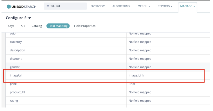
Then, update the same in unbxd-search.config.json present on the root level of the newly created React App. For example, if you have mapped “imageUrl” to “Image_Link” as shown above, then update the same in the JSON file like below://unbxd-search.config.json { ... "attributesMap": { "productName": "title", "uniqueId": "uniqueId", "imageUrl": "Image_Link", "price": "price", "sellingPrice": "selling_price", "productUrl": "productUrl" } ... }Refer to this section for more details on how to retrieve the mapped fields configuration.
- Finally, run the React app to experience the Unbxd search for your site. On the root directory of the project run any of the below commands based on your preferred package manager:
yarn start
In the following sections, we will discuss how to configure and render each of these sections with the React Search SDK.
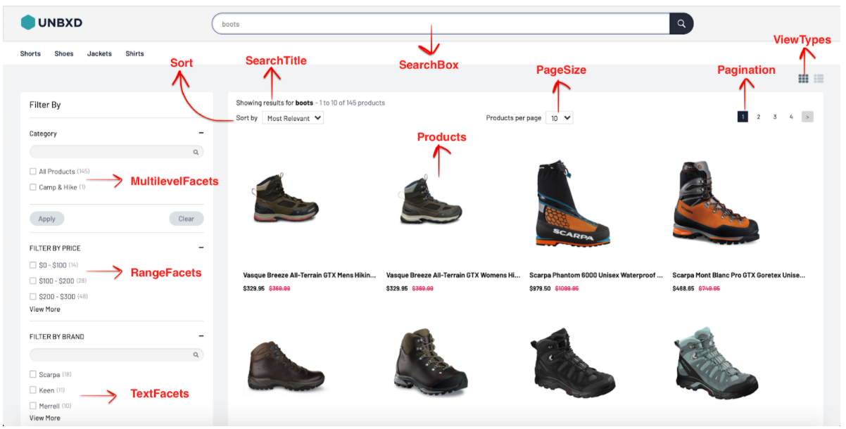
A module to enter the search query.

The component contains input and a submit button by default. SearchBox can be further customized by passing a custom Input component, Submit a component according to your needs.
A module to handle the rendering of the products.
The module requires a dimension map of the attributes to render the products on the UI. The mapping can be defined as mentioned below:
const attributesMap = {
	productName: “title”,
	uniqueId: “uniqueId”,
	imageUrl: “imageUrl”,
	price: “default_price”,
	sellingPrice: “cheapest_price”
 }
The variants of a product will not be grouped together by default. To enable grouping of variants, pass `showVariants` as `true`. Variants require a mapping of their own. The mapping can be defined as mentioned below.
const variantAttributesMap = {
	productName: “v_title”,
	uniqueId: “v_uniqueId”,
	imageUrl: “v_imageUrl”,
	price: “v_default_price”,
	sellingPrice: “v_cheapest_price”
 }
Apart from handling the number of products per row and the total number of products per page, we can also handle the pagination type of products. The module supports infinite scroll, click and scroll and fixed pagination which can be controlled by `paginationType`prop.
Fixed Pagination
If `paginationType` is set to `FIXED_PAGINATION`, please include the `Pagination`component which handles the navigation between pages.
Infinite Scroll
If `paginationType` is set to `INFINITE_SCROLL`, the scroll height difference to trigger the next page can be passed by `heightDifferenceToTriggerNextPage` prop.
Click And Scroll
If `paginationType` is set to `CLICK_N_SCROLL`, the module provides an inbuilt Load More component which can be overridden by passing a custom `loadMoreComponent`.
Product cards can be further customized by passing a custom `productItemComponent` to the module.
Products Props
|
Prop |
Description |
Data type |
Required |
Default |
|
pageSize |
Number of products to be loaded on a page. |
number |
false |
10 |
|
paginationType |
Products displayed on a page. Possible options are INFINITE_SCROLL, CLICK_N_SCROLL and FIXED_PAGINATION. |
string |
false |
‘FIXED _PAGINATION’ |
|
heightDiffTo TriggerNextPage |
Height difference to trigger for next page in case of paginationType INFINITE_SCROLL. |
number |
false |
100 |
|
loadMoreComponent |
Custom component instance to load more products in case of CLICK_N_SCROLL |
element |
false |
– |
|
productIdAttribute |
Unique ID of the product. |
string |
false |
‘uniqueId’ |
|
attributesMap |
Mapping of catalog Product fields to SDK’s Product fields. |
object |
true |
– |
|
showVariants |
Display if the product has other variants. |
bool |
false |
false |
|
variantsCount |
Number of variants to fetch. |
number |
false |
5 |
|
variantAttributes Map |
Mapping of catalog Product variant fields to SDK Product variant fields. |
object |
false |
– |
|
showLoader |
Should a loader be shown. |
bool |
false |
false |
|
loaderComponent |
Custom loader component. |
element |
false |
default Loader |
|
onProductClick |
Callback function triggered on click of a product. |
func |
false |
– |
|
onZeroResults |
Callback function triggered on zero results. |
func |
false |
– |
|
showSwatches |
Display a small color/image swatch for the product |
bool |
false |
– |
|
groupBy |
Club variants together by the attribute. |
string |
false |
– |
|
swatchAttributes Map |
Swatch attributes that change on click of the swatch. |
object |
false |
– |
|
swatchItem Component |
Custom swatch component instance. |
element |
false |
– |
|
productItem Component |
Custom product item component instance. |
element |
false |
– |
|
zeroResults Component |
Custom zero results component instance. |
element |
false |
– |
At the end of this step, you should have configured the Products component as shown below:
 <UnbxdSearchWrapper siteKey={<site key>} apiKey={<api key>}
   ...
   <Product
   ...
   perRow={3}
   attributesMap={attributesMap}
   showVariants={true}
   variantsCount={2}
   variantAttributesMap={variantAttributesMap}
/>
   ...
 </UnbxdSearchWrapper/>
A module to display text based filters. For ex. brand, type, size, etc.
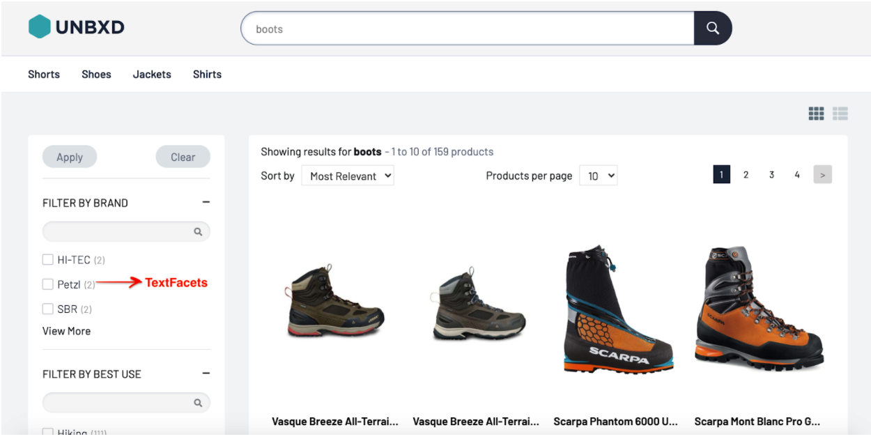
This module displays the text-based facets (like brand, type, size) that can be applied by the user for the better filtering of the products.
facetItemComponent
`TextFacets` can be further customized by passing a custom component instance.
const FacetItemComponent = ({ itemData, onClick }) => {
    const { name, count, isSelected } = itemData;
    const handleClick = () => {
        onClick(itemData);
    };

    return (
        <div
            className={`UNX-facet__item ${isSelected ? '-selected' : ''}`}
            onClick={handleClick}
        >
            <div className="-checkbox"></div>
            <div className="-label">{name}</div>
            <div className="-count">({count})</div>
        </div>
    );
 };
TextFacets Props
|
Prop |
Description |
Data type |
Required |
Default |
|
facetItemComponent |
Custom facet item component instance |
element |
false |
– |
|
Label |
Label for the component. |
string |
false |
– |
At the end of this step, you should have configured the TextFacets component as shown below:
 <UnbxdSearchWrapper siteKey={<site key>} apiKey={<api key>}
  ...
  <TextFacets />
  ...
 </UnbxdSearchWrapper/
A module to display numerical facets. For ex. price.
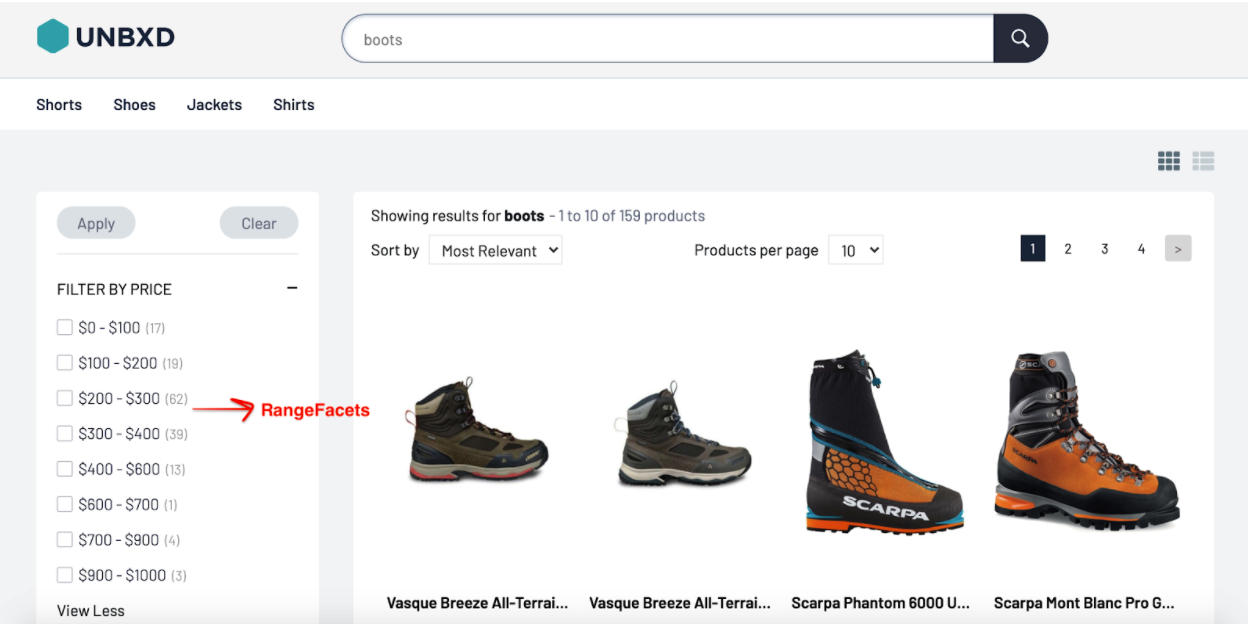
This module displays the range facets that can be applied by the user for the better filtering of the products.
A module to display hierarchical facets.
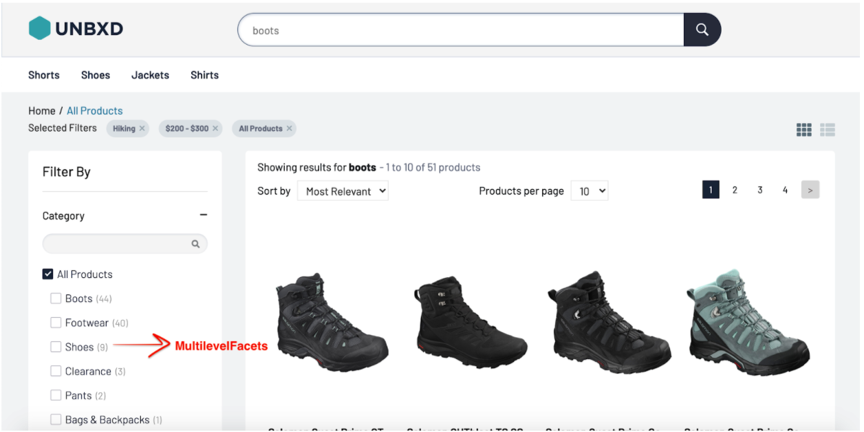
This module displays the multilevel facets that can be applied by the user for the better filtering of the products.
facetDepth
Maximum depth of the category.
facetLimit
Maximum number of values present in a facet.
facetItemComponent
`MultilevelFacets` can be further customized by passing a custom component instance.
 const FacetItemComponent = ({ itemData, onClick }) => {
    const { name, count, level, isSelected } = itemData;
    const handleClick = () => {
        onClick(itemData);
    };
    return (
        <div
            className={`UNX-facet__item -l${level} ${
                isSelected ? '-selected' : ''
            }`}
            onClick={handleClick}
        >
           <div className="-checkbox"></div>
            <div className="-label">{name}</div>
            {count && <div className="-count">({count})</div>}
        </div>
    );
 };
MultilevelFacets Props
|
Prop |
Description |
Data type |
Required |
Default |
|
facetDepth |
Max sub categories of a category. |
number |
false |
6 |
|
facetLimit |
Maximum number of values present in a facet. |
number |
false |
100 |
|
facetItemComponent |
Custom Facet item component instance. |
element |
false |
– |
|
label |
Label for the module. |
string |
false |
– |
At the end of this step, you should have configured the TextFacets component as shown below:
 <UnbxdSearchWrapper siteKey={<site key>} apiKey={<api key>}
  ...
   <MultilevelFacets />
  ...
 </UnbxdSearchWrapper/>
A module to display selected facets.
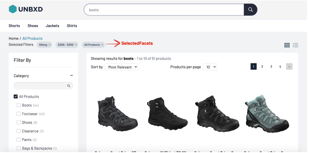
This module displays the selected facets that can be removed by the user with ease.
facetItemComponent
`SelectedFacets` can be further customized by passing a custom component instance.
const FacetItemComponent = ({ itemData, onClick, priceUnit }) => {
    const { name, type, dataId } = itemData;
    const handleClick = () => {
        onClick(itemData);
    };

    let selectedFacetMarkup = null;
    if (type === 'TEXT_FACET') {
        selectedFacetMarkup = <span>{name}</span>;
    }
    if (type === 'RANGE_FACET') {
        const [valMin, valMax] = dataId.split(' TO ');
        selectedFacetMarkup = (
         <span>
        {priceUnit} {valMin} - {priceUnit} {valMax}
        </span>
        );
    }
    if (type === 'MULTILEVEL_FACET') {
        selectedFacetMarkup = <span>{name}</span>;
    }
    return (
    <div className="UNX-selectedFacets__item" onClick={handleClick}>
    {selectedFacetMarkup} <span className="-cross"></span>
    </div>
    );
 };
SelectedFacets Props
|
Prop |
Description |
Data type |
Required |
Default |
|
facetItemComponent |
Custom facet item component instance |
element |
false |
– |
|
Label |
Label for the component. |
string |
false |
– |
At the end of this step, you should have configured the SelectedFacets component as shown below:
 <UnbxdSearchWrapper siteKey={<site key>} apiKey={<api key>}
   ...
   <SelectedFacets/>
   ...
 </UnbxdSearchWrapper
A module to display the current page path.
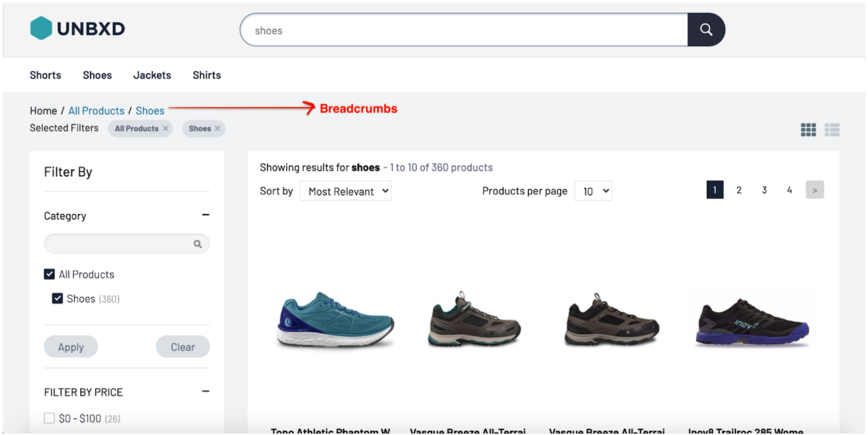
This module displays the current page path with all the levels that allow the user to navigate the categories better.
root
An element depicting the root of the breadcrumb. This level points to the root of the category hierarchy.
const Root=() =><span>Home</span>;
separator
An element separating the levels of a category hierarchy.
const separator = <span>/</span>;
breadcrumbItemComponent
`Breadcrumbs` can be further customized by passing a custom component instance.
const BreadcrumbItemComponent = ({
    itemData,
    Root,
    separator,
    idx,
    onClick,
}) => {
    const { value } = itemData;
    const handleClick = () => {
        onClick(itemData);
    };
    return (
    <>
    {idx === 0 && }
    {''}
    {separator}
    {''}
     <div className={'UNX-breadcrumbs-list-item'} onClick={handleClick}>
     {value}
     </div>
     </>
    );
 };
Breadcrumb Props
|
Prop |
Description |
Data type |
Required |
Default |
|
root |
Root of the breadcrumb. |
element | node |
true |
– |
|
breadcrumbItemComponent |
Custom breadcrumb component instance. |
element |
false |
– |
At the end of this step, you should have configured the SearchTitle component as shown below:
 <UnbxdSearchWrapper siteKey={<site key>} apiKey={<api key>}
   ...
   <Breadcrumbs root={<Root/>} separator={separator} />
   ...
 </UnbxdSearchWrapper/>
A module to display actions performed on any of the displayed facets.
This module allows the user to apply or clear facets with ease.
showApplyFilter
Hide/Display the facet apply component.
showClearFilter
Hide/Display the facet clear component.
applyFilterComponent
Apply Filter component can be further customized by passing a custom instance.
const ApplyFilterComponent = ({ onApplyFilter }) => (
);
clearFilterComponent
clear Filter component can be further customized by passing a custom instance.
const ClearFilterComponent = ({ onClearFilter }) => (
);
FacetActions Props
|
Prop |
Description |
Data type |
Required |
Default |
|
showApplyFilter |
Enable apply facets. |
bool |
false |
true |
|
showClearFilter |
Enable clear facets. |
bool |
false |
true |
|
applyFilterComponent |
Custom apply filter component instance |
element |
false |
– |
|
clearFilterComponent |
Custom clear filter component instance |
element |
false |
– |
|
onApply |
Callback called on the click of apply. |
func |
false |
– |
|
onClear |
Callback called on the click of clear. |
func |
false |
– |
At the end of this step, you should have configured the FacetActions component as shown below:
  <UnbxdSearchWrapper siteKey={<site key>} apiKey={<api key>}
    ...
   <FacetActions
   applyFilterComponent{ApplyFilterComponent}
   clearFilterComponent={ClearFilterComponent}
   />
     ...
  </UnbxdSearchWrapper>
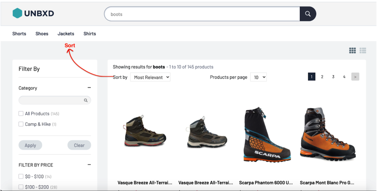
A module to sort the products on different attributes.
sortOptions
The mandatory sort options can be provided by prop `sortOptions`.
 const sortOptions = [
  {
    label: 'Most Popular'
  },
  {
    label: 'Newest',
    field: 'Date_Added',
    order: 'desc'
  },
  {
    label: 'Lowest Price',
    field: 'price',
    order: 'asc'
  }
 ]
sortItemComponent
`Sort` can be further customized by setting `displayType` to `LIST` and passing a custom component instance.
 const SortItemComponent = ({ itemData, onClick }) => {
    const { value, isSelected = false } = itemData;
    const handleClick = () => {
        onClick(itemData);
    };
    return (
    <button
    className={`UNX-sortby__item ${isSelected ? '-selected' : ''}`}
     data-testid={value.split('|').join(' ')}
     onClick={handleClick}
        >
    {itemData.label}
     </button>
    );
 };
Sort Props
|
Prop |
Description |
Data type |
Required |
Default |
|
sortOptions |
Filter out products based on the categories provided like ‘Most Relevant’ or ‘Most Recent’. |
object |
true |
– |
|
displayType |
Products can appear in either a `DROPDOWN` or a ` LIST` format |
string |
false |
‘DROPDOWN’ |
|
sortItemComponent |
Custom sort item component instance |
element |
false |
– |
|
label |
Label for the component. |
node |
false |
– |
At the end of this step, you should have configured the Sort component as shown below:
 <UnbxdSearchWrapper siteKey={<site key>} apiKey={<api key>}
    ...
   <Sort sortOptions={[...]} />
   ...
 </UnbxdSearchWrapper/>

This module is displayed only when `paginationType` on `Products` is set to `FIXED_PAGINATION`. If `paginationType` on `Products`is set to `INFINITE_SCROLL` or `CLICK_N_SCROLL`, `Pagination` will be hidden.
padding
The number of pages on either side of the active page can be configured by passing padding.
paginationItemComponent
The default Pagination item component can be overridden by passing a custom component instance.
 const PaginationItemComponent = ({itemData, onClick}) => {
  const { pageNumber, type } = itemData;
  const handleClick = () => {
    onClick(itemData);
  };
  return (
  );
 };
Pagination Props
|
Prop |
Description |
Data type |
Required |
Default |
|
padding |
Pages on either side of the active page |
number |
false |
2 |
|
paginationItemComponent |
Custom pagination item component instance |
element |
false |
– |
At the end of this step, you should have configured the Pagination component as shown below:
 } apiKey={}
   ...

   ...
 </UnbxdSearchWrapper/>
A module to handle products’ display.

viewTypes
You can view the products in either a GRID or LIST style. These can be passed using viewTypes. The first view option passed will be treated as the default view type.
viewItemComponent
`ViewTypes` can be further customized by setting `displayType` to `LIST` and passing a custom component instance.
 const ViewItemComponent = ({ itemData, onClick }) => {
   const { viewType, isSelected } = itemData;
   const iconClassName = viewType === 'GRID' ? `fa fa-th` : `fa fa-th-list`;
   const dataTestId = viewType === 'GRID' ? `UNX_gridBtn` : `UNX_listBtn`;
   const handleClick = () => {
       onClick(itemData);
   };
   return (
   <div className="UNX-viewType__wrapper">
   <span
   className={`UNX-viewType__option ${
                   isSelected ? '-selected' : ''
               }`}
               data-testid={dataTestId}
               onClick={handleClick}
           >
    <i className={iconClassName}></i>
    </span>
    </div>
   );
 };
viewTypes Props
|
Prop |
Description |
Data type |
Required |
Default |
|
viewTypes |
Display style of products which can be either in `GRID` style or in `LIST`. |
object |
false |
[‘GRID’] |
|
displayType |
Products can either be clubbed as a list or a dropdown menu. Possible options are `LIST` and `DROPDOWN`. |
string |
false |
‘LIST’ |
|
viewItem Component |
Custom LIST item component instance. |
element |
false |
– |
At the end of this step, you should have configured the ViewTypes component as shown below:
  <UnbxdSearchWrapper siteKey={<site key>} apiKey={<api key>}
    ...
    <ViewTypes  viewTypes={['GRID', 'LIST']} />
    ...
 </UnbxdSearchWrapper/>
A module to handle the number of products displayed per page.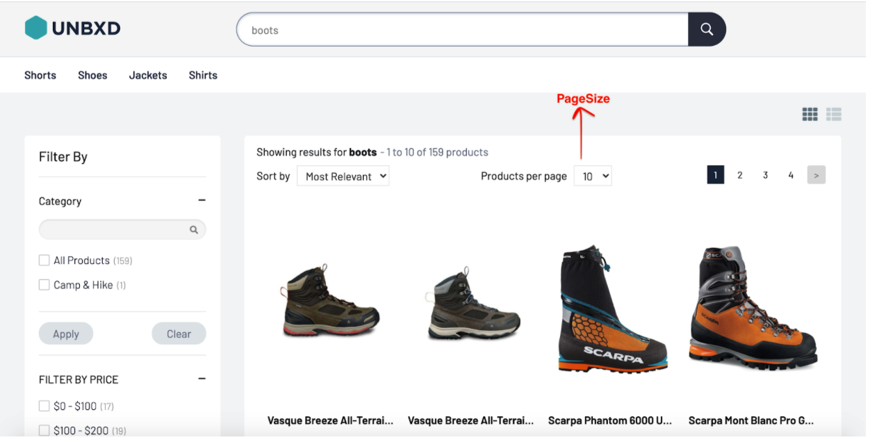
A module to handle query suggestions.
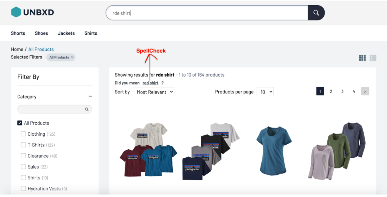
This module tries to suggest an alternate search query based on your query which may yield better results.
spellCheckItemComponent
`SpellCheck` can be further customized by passing a custom instance.
 const SpellCheckItemComponent = ({ itemData, onClick }) => {
    const { suggestion } = itemData;
    const handleClick = () => {
        onClick(itemData);
    };
    return (
     <div className="UNX-spellCheck__item">
    Did you mean
    <span
       className="-suggestion"
       onClick={handleClick}
       data-testid={'UNX_spellCheck'}
     >
       {suggestion}
      </span>
            ?
      </div>
Spellcheck Props
|
Prop |
Description |
Data type |
Required |
Default |
|
spellCheckItemComponent |
Custom spellcheck component instance |
element |
false |
– |
At the end of this step, you should have configured the SpellCheck component as shown below:
 <UnbxdSearchWrapper siteKey={<site key>} apiKey={<api key>}
   ...
   <SpellCheck />
   ...
 </UnbxdSearchWrapper/>
A module to display search metadata

This module displays the current search query along with the number of products loaded currently and the total number of products.
searchTitleItem
`SearchTitle` can be further customized by passing a custom instance.
const SearchTitleItem = (props) => {
  const { searchQuery, start, productsLn, numberOfProducts } = props;
  return (
    <div>
      Showing results for {searchQuery} - {start + 1} to {start + productsLn} of{' '}
      {numberOfProducts} products
   </div>
  );
 };
searchTitle Props
|
Prop |
Description |
Data type |
Required |
Default |
|
searchTitleItem |
Custom search title item component instance. |
element |
false |
– |
At the end of this step, you should have configured the SearchTitle component as shown below:
<UnbxdSearchWrapper siteKey={<site key>} apiKey={<api key>}
   ...
   <SearchTitle />
   ...
 </UnbxdSearchWrapper/>
A module to display merchandising banners.
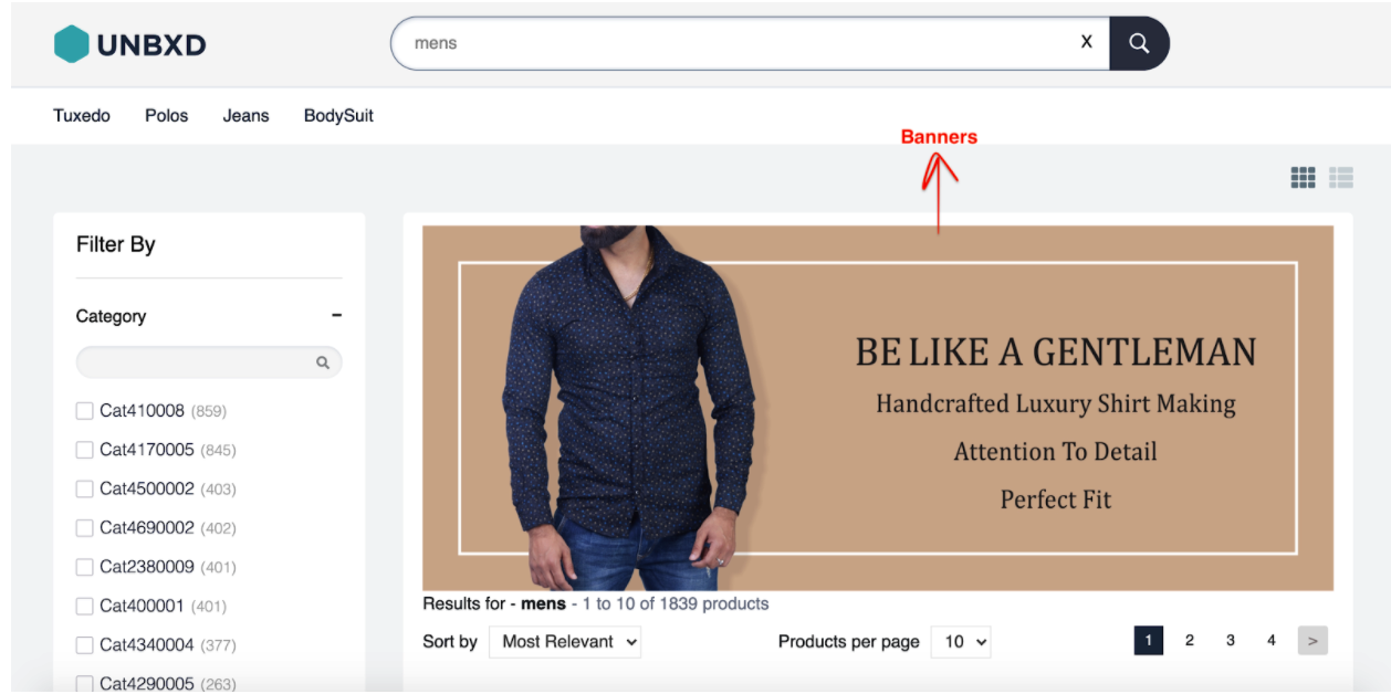
This module displays the banners configured based on search/category/event.
alText
Add an alternate text for the image.
altText="alt banner text"
bannerItemComponent
`Banner` can be further customized by passing a custom instance.
 const BannerItemComponent = ({ itemData }) => {
   const { imageUrl } = itemData;
   return <img src={imageUrl} />;
 };
Banner Props
|
Prop |
Description |
Data type |
Required |
Default |
|
altText |
Image alt text |
string |
false |
‘banner image’ |
|
bannerItemComponent |
Custom Banner component instance |
element |
false |
– |
At the end of this step, you should have configured the Banners component as shown below:
 <UnbxdSearchWrapper siteKey={<site key>} apiKey={<api key>}
    ...
    <Banners altText="alt banner text" />
    ...
 </UnbxdSearchWrapper/>
- Did this answer your question?
