
- Prepare your Schema
- Prepare your Catalog
- Upload your Feed
- Full Feed Upload
- Delta Feed Upload
- Single Record Upload
- Check Product Count

- Search Endpoint
- Authentication
- Header
- Request Parameter
- Response Components
- Explanation Request Parameter
- PDP API Format
- Sample Request
- Request Parameters
- Response Parameters
- System Requirements
- Install SDK
- Initialize SDK
- Unbxd Commerce Search
- Integrating Unbxd Autosuggest
- Unbxd Analytics
- Unbxd Browse
- Unbxd Recommendations
- Sample App
- Installation
- Unbxd Analytics
- Unbxd Commerce Search
- Unbxd Autosuggest
- Unbxd Browse
- Unbxd Recommendations
- Sample iOS App
- Quickstart with Unbxd Template
- Quick Integration to your site
- Detailed Guide
- Authentication
- Types of Pages to Render
- Configuring the Page
- Instance Methods
- More Information
- Available Configurations
- Libraries
- QuickStart
- Authentication
- Configuring Autosuggest
- Sample Options Object
- Handlebar Functions
- List of Configs
- Search Template
- Loader Config
- Facet Config
- Pagination
- Spellcheck
- Sort Config
- PageSize Config
- Breadcrumb Config
- Product Views
- Variants
- Quick Integration with Unbxd template
- Quick Integration to your site
- Installation
- Authentication
- Types of pages to render
- Configuring the page
- PageSize Config
- More Info
- Endpoint
- Authentication
- Headers
- Request Parameters
- API Response
- Response Components
- Create an Unbxd Account
- Create an Unbxd Site
- Upload a Catalog
- Setup Search
- Integrate Search
- Create an Unbxd Account
- Create an Unbxd Site
- Upload a Catalog
- Setup Search
- Integrate Search
- Plugin Installation
- Configuration
- Uninstallation
- Test Plugin Installation
- Installation
- Authentication
- Catalog
- Catalog Sync
- Product Integration
- Custom Template
- Indexing Queue View
- Feed View
- Upgrade
- Uninstall
- Installation
- Authentication
- Catalog
- Cron Job
- Product Config
- Uninstall
- Installation
- Configuration
- Download the Unbxd Search Library default template package from here.
- Unzip the package & open the index.html file inside the folder.
- Update the global variables UNBXD_SITE_KEY and UNBXD_API_KEY present in the “HEAD” section. “Script” tag of the index.html file with your Site key & API keys.
window.UNBXD_SITE_KEY= your site key
window.UNBXD_API_KEY= your API key
Refer to this section for steps on how to get the Site Key & API Key for your account - Update the global variable “UNBXD_MAPPED_FIELDS” with the field mapping of your catalog fields.
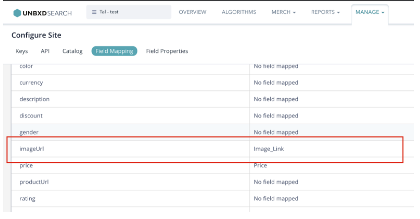
window.UNBXD_MAPPED_FIELDS ={
"imageURL" : "IMAGE_LINK",
"price" : "PRICE",
"title": "TITLE",
"categoryPath":null,
"productURL":"productURL",
"description":description"
};
Refer to this section on how to get these field mappings for your account. - Open index.html in your browser to view the search results landing page for your catalog with the Unbxd default template.
In the following sections , we will discuss how to configure and render each of these sections with the Unbxd Search JS SDK.
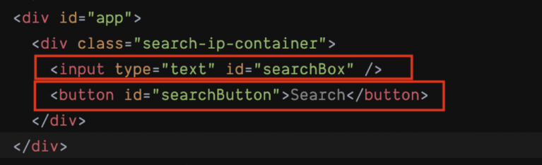
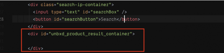
At the end of this step, you should have configured the “inputSelector” & “searchButtonSelector” as shown below:
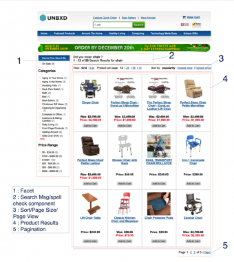
To render the products that resulted from the search API for the search term, you need to configure the CSS selector of the search results container. For this you can use the “searchResultContainer” config.
searchResultContainer:
|
Data type |
string |
|
Required |
true |
|
Default |
NA |
|
Description |
CSS selector of the product results wrapper in your webpage |
|
Sample Value |
#unbxd_product_results_container |
In addition to the “searchResultContainer”, you can also configure the handlebars template to be used for each of the product cards using the “searchResultSetTemp” config.
searchResultSetTemp:
|
Data type |
array/function |
|
Required |
true |
|
Default |
|
|
Description |
When configured as an array, a html scheme to display the product for each view type has to be configured Or a javascript function , where the data above will be passed as an input argument and the function should handle the dynamic binding of the html section |
|
Input Value |
Properties in the input object, numberOfProducts:number -> Total Count of products matching the search term or browse location Start:number -> starting position of the result in the array (this would change while paginating through pages) Products:array -> Product result data *input data -> {numberOfProducts: 5361 start: 0 products: [ { productUrl: “/shop/prod/mens-spring-step-casual-shoes/423424.htm” was_price_min: 69.95 title: “Mens Spring Step Casual Shoes” was_price_max: 69.95 uniqueId: “ZTZ47C” price_max: 69.95 brand: [“Spring Step”] price_min: 69.95 more_colors_available: “true” imageUrl: [“/images/store/product/images/563794479patrick.jpg”] variantTotal: 5 score: 0.4200723 relevantDocument: “parent” variantCount: 5 unbxdprank: 1 }] unbxdparam_requestId: null } |
|
Sample Value |
[ grid: [{{#products}} <div class=”unbxd_product_tile”> <a href=”{{productUrl}}” class=”image-hover unbxd-product-image” title=”{{title}}” data-url=”{{productUrl}}” unbxdparam_title=”{{ItemName}}” unbxdattr=”product” unbxdparam_sku=”{{uniqueId}}” unbxdparam_prank=”{{unbxdprank}}”> <img alt=”{{title}}” src=”{{imageurl}}”>
<div class=”prod_price assortment_price”> <div class=”clearfix subpend-1 price-display featured-pricing money” itemtype=”http://schema.org/Offer” itemscope=”” itemprop=”offers”> <span class=”bold”>Price: </span> <span class=”bold m-large” itemprop=”price”><span class=”dollar”>$</span>{{price_min}} – ${{price_max}}</span> </div> </div> <div class=”suppend-1 prod_title”> {{title}} </div> <div class=”subpend-1 product-ratings”><img class=”sli_ratings_scaled ae-img” src/store/content/bazaarVoice/images/{{no_of_stars}}.gif” alt=”{{no_of_stars}} star rating”> ({{getReviewCount}} review)</div> <p class=”sli_grid_excerpt”>{{description}}</p> </a> </div> {{/products}}].join(‘’), List: [{{#products}} <div class=”unbxd_product_list_tile”> <div class=”unbxd_col1″> <a href=”{{#getRelativePath productUrl}}{{/getRelativePath}}”><img src=”{{#getRelativePath imageUrl}}{{/getRelativePath}}” alt=”{{ItemName}}” title=”{{ItemName}}” unbxdparam_title=”{{ItemName}}” unbxdattr=”product” unbxdparam_sku=”{{uniqueId}}” unbxdparam_prank=”{{unbxdprank}}”></a></div> <div class=”unbxd_col2″> <h2 class=”unbxd_product_title”><a href=”{{#getRelativePath productUrl}}{{/getRelativePath}}” title=”{{ItemName}}” unbxdparam_title=”{{ItemName}}” unbxdattr=”product” unbxdparam_sku=”{{uniqueId}}” unbxdparam_prank=”{{unbxdprank}}”>{{ItemName}}</a></h2> {{#if ShortDescription}}<div class=”unbxd_product_description”>{{#trim ShortDescription maxchar=400 }} {{/trim}}<span>…<a href=”{{#getRelativePath productUrl}}{{/getRelativePath}}”>More</a></span></div>{{/if}} <div class=”unbxd_product_price”> {{#ifValidPrice OriginalPrice CurrentPrice}} {{#isSalePriceOffered OriginalPrice CurrentPrice}}<div>Was: <span class=”was_price”>${{#priceFormatter OriginalPrice}}{{/priceFormatter}}</span></div> <div class=”promo_price”>Price: ${{#priceFormatter CurrentPrice}}{{/priceFormatter}}</div>{{else}} <div class=”sell_price”>Price: ${{#priceFormatter CurrentPrice}}{{/priceFormatter}}</div> {{/isSalePriceOffered}} {{/ifValidPrice}} <div class=”unbxd-add-to-cart”> {{#ifValidPrice OriginalPrice CurrentPrice}} <form action=”/shop.axd/AddToCartBP”> <input type=”hidden” name=”edp_no” value=”{{ProductId}}” /><input type=”hidden” name=”qty” value=”1″ /> <input type=”image” class=”addToCart” src=”{{#getRelativePath “https://www.firststreetonline.com/images/buttons/addToCart.png”}}{{/getRelativePath}}” value=”Submit” alt=”{{ItemName}}” unbxd_variant_count=”{{variantCount}}” unbxd_product=”{{ProductId}}” /> </form> {{else}} <a href=”{{#getRelativePath productUrl}}{{/getRelativePath}}” unbxdparam_title=”{{ItemName}}” unbxdattr=”product” unbxdparam_sku=”{{uniqueId}}” unbxdparam_prank=”{{unbxdprank}}” class=”unbxd-clickable-text”><span>Click for More Info</span></a> {{/ifValidPrice}} </div> </div> </div> <div class=”clear”></div> </div> {{/products}} ].join(‘’) ] |
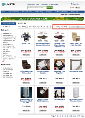
Sorting allows you to rearrange the search results based on certain fields in a particular order.
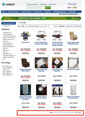
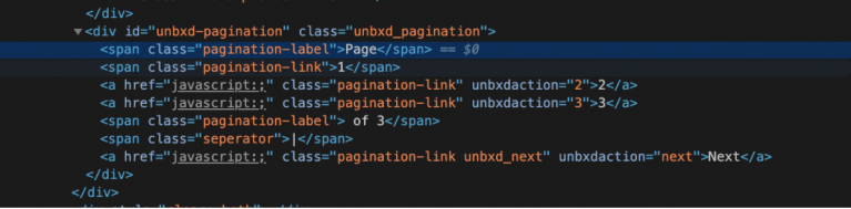
Pagination displays the right set of products with respect to the number of products shown on one page(rows parameter).
You can configure the different pagination sections in a certain way.
Traditional Based Pagination
This traditional type of pagination displays the set number of products on one page.

Infinite scroll based pagination
To implement an infinite scroll or auto scroll based pagination, set the “isAutoScroll” config to “true”
isAutoScroll:
|
Data type |
boolean |
|
Required |
False |
|
Description |
Set it to “true” if you want infinite scroll or autoscroll behaviour for the pagination |
|
Default Value |
false |
|
Accepted values |
true (or) false |
You can configure the height at which to trigger API call to fetch the next page results using the “heightDiffToTriggerNextPage” config
heightDiffToTriggerNextPage:
|
Data type |
number |
|
Required |
True ( when isAutoScroll is set to true) |
|
Default Value |
100 |
|
Description |
Numeric representation in pixels from bottom of the page before which a call to fetch the next page results should kick in |
|
Sample values |
250 When value is set to 250, when the scroll position has reached less than 250 px to the bottom of the page, the next set of results will be loaded |
Load More button pagination
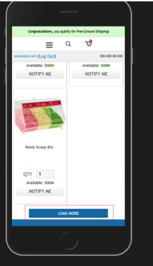
If you want to show a “Load More” button to trigger pagination, set the “isClickNScroll” config to true.
isClickNScroll:
|
Data type |
boolean |
|
Required |
False |
|
Default Value |
false |
|
Description |
Set this to true if you want to simulate a “load more” results behaviour instead of having auto scroll or paginated links |
|
Sample values |
true |
If “isClickNScroll” config is set to “true”, provide the “load more” button container selector using the “clickNScrollElementSelector” config.
clickNScrollElementSelector:
|
Data type |
String |
|
Required |
True (if isClickNScroll is true) |
|
Default Value |
#load-more |
|
Description |
CSS selector of the button or link which would trigger the load more action |
|
Sample values |
#load_more_results |
This section documents the different properties used to configure the different aspects of facets or filters section on your webpage
To render the facets on the search results page, you need to configure the CSS selector of the facets container in your webpage. For this you can use the “facetContainerSelector” config.
facetContainerSelector:
|
Data type |
string |
Required |
True |
|
Default Value |
NA |
||
|
Description |
CSS selector of the section which should contain the facets for the search results |
||
|
Sample values |
#facets_container |
||
If you have checkboxes for the facet values, configure their CSS selector using the “facetCheckboxSelector” config.
facetTemp:
|
Data type |
string |
Required |
false |
|
Default Value |
[‘{{#each filters}}’, ‘<ol>’, ‘<li>’, ‘<span class=”label”>{{@key}}:</span>’, ‘{{#each this}}’, ‘<div class=”refineSect”>{{@key}}<a href=”#” class=”btn-remove”></a>’, ‘</div>’, ‘{{/each}}’, ‘</li>’, ‘</ol>’, ‘{{/each}}’].join(”) |
||
|
Description |
String representation of the HTML schema to display the facet section |
||
|
Input Value |
*input data -> { facets:[ { “name”:”Rating”, “facet_name”:”ratings_uFilter”, “type”:”facet_fields”, “selected”:[ { “value”:”1″, “count”:429, “isMultilevel”:false } ], “unselected”:[ { “value”:”2″, “count”:395, “isMultilevel”:false }, { “value”:”3″, “count”:1121, “isMultilevel”:false }, { “value”:”4″, “count”:4389, “isMultilevel”:false }, { “value”:”5″, “count”:4706, “isMultilevel”:false } ], “unordered”:[ { “value”:”1″, “count”:429, “isSelected”:false, “isMultilevel”:false }, { “value”:”2″, “count”:395, “isSelected”:false, “isMultilevel”:false }, { “value”:”3″, “count”:1121, “isSelected”:false, “isMultilevel”:false }, { “value”:”4″, “count”:4389, “isSelected”:false, “isMultilevel”:false }, { “value”:”5″, “count”:4706, “isSelected”:false, “isMultilevel”:false } ], “isMultilevel”:false, “expandByDefault”:false, “searchEnabled”:false }], “rangefacets”:[ { “name”:”Price Range”, “facet_name”:”was_price_max”, “type”:”facet_ranges”, “selected”:[ ], “unselected”:[ { “begin”:”0″, “end”:”200″, “count”:71316, “value”:”0 TO 200″ }, { “begin”:”200″, “end”:”400″, “count”:4577, “value”:”200 TO 400″ }, { “begin”:”400″, “end”:”600″, “count”:1586, “value”:”400 TO 600″ }, { “begin”:”600″, “end”:”800″, “count”:782, “value”:”600 TO 800″ }, { “begin”:”800″, “end”:”1000″, “count”:402, “value”:”800 TO 1000″ } ], “unordered”:[ { “begin”:”0″, “end”:”200″, “count”:71316, “value”:”0 TO 200″, “isSelected”:false }, { “begin”:”200″, “end”:”400″, “count”:4577, “value”:”200 TO 400″, “isSelected”:false }, { “begin”:”400″, “end”:”600″, “count”:1586, “value”:”400 TO 600″, “isSelected”:false }, { “begin”:”600″, “end”:”800″, “count”:782, “value”:”600 TO 800″, “isSelected”:false }, { “begin”:”800″, “end”:”1000″, “count”:402, “value”:”800 TO 1000″, “isSelected”:false } ], “isMultilevel”:false, “expandByDefault”:false } ] }
|
||
|
Sample values |
<div class=”facet_heading” precompiled>Narrow Your Search By</div> {{#facets}} <div id=”{{facet_name}}”> <h3 class=”facet_title”>{{name}} {{#if selected.length}} <a unbxdParam_facetName=”{{facet_name}}” unbxdParam_facetType=”{{type}}” href=”javascript:;” class=”facet_reset”>Clear all</a> {{/if}} </h3> <div class=”facet_values”> {{#selected}} <div class=”facet_value”> <input type=”checkbox” id=”{{../facet_name}}-{{value}}” class=”selected” checked unbxdParam_facetName=”{{../facet_name}}” unbxdParam_facetValue=”{{value}}” title=”{{value}}” data-id=”{{../facet_name}}” data-value=”{{value}}” data-parent-label=”{../name}}” data-count=”{{count}}” rel=”nofollow”> <label for=”{{../facet_name}}-{{value}}” class=”selected”>{{#unbxdIf ../facet_name “v_PriceRange_uFilter”}}{{value}}{{else}}{{value}}{{/unbxdIf}}<span class=”facet_result_count”>({{count}})</span></label> </div> {{/selected}} {{#unselected}} <div class=”facet_value” unbxdDisplay_Type=”{{displayType}}” {{#if ../viewall}}style=”display:flex”{{/if}}> <input type=”checkbox” id=”{{../facet_name}}-{{value}}” unbxdParam_facetName=”{{../facet_name}}” unbxdParam_facetValue=”{{value}}” title=”{{value}}” data-id=”{{../facet_name}}” data-value=”{{value}}” data-parent-label=”{../name}}” data-count=”{{count}}” rel=”nofollow”> <label for=”{{../facet_name}}-{{value}}”>{{#unbxdIf ../facet_name “v_PriceRange_uFilter”}}{{value}}{{else}}{{value}}{{/unbxdIf}}<span class=”facet_result_count”>({{count}})</span></label> </div> {{/unselected}} {{#if displayType}} <a href=”javascript:;” class=”facet_more_link” unbxdParam_facetName=”{{facet_name}}” {{#if viewall}}style=”display:none”{{/if}}>more</a> <a href=”javascript:;” class=”facet_less_link” unbxdParam_facetName=”{{facet_name}}” {{#if viewall}}style=”display:inline”{{/if}}>less</a> {{/if}} </div> </div> {{/facets}} {{#rangefacets}} <div id=”{{facet_name}}”> <h3 class=”facet_title”>{{name}} {{#if selected.length}} <a unbxdParam_facetName=”{{facet_name}}” unbxdParam_facetType=”{{type}}” href=”javascript:;” class=”facet_reset”>Clear all</a> {{/if}} </h3> <div class=”facet_values”> {{#selected}} <div class=”facet_value”> <input type=”checkbox” id=”{{../facet_name}}-{{value}}” class=”selected” checked unbxdParam_facetName=”{{../facet_name}}” unbxdParam_facetValue=”{{value}}” title=”{{value}}” data-id=”{{../facet_name}}” data-value=”{{value}}” data-parent-label=”{../name}}” data-count=”{{count}}” rel=”nofollow”> <label for=”{{../facet_name}}-{{value}}” class=”selected”>{{value}}<span class=”facet_result_count”>({{count}})</span></label> </div> {{/selected}} {{#unselected}} <div class=”facet_value” unbxdDisplay_Type=”{{displayType}}” {{#if ../viewall}}style=”display:flex”{{/if}}> <input type=”checkbox” id=”{{../facet_name}}-{{value}}” unbxdParam_facetName=”{{../facet_name}}” unbxdParam_facetValue=”{{value}}” title=”{{value}}” data-id=”{{../facet_name}}” data-value=”{{value}}” data-parent-label=”{../name}}” data-count=”{{count}}” rel=”nofollow”> <label for=”{{../facet_name}}-{{value}}”>{{value}}<span class=”facet_result_count”>({{count}})</span></label> </div> {{/unselected}} {{#if displayType}} <a href=”javascript:;” class=”facet_more_link” unbxdParam_facetName=”{{facet_name}}” {{#if viewall}}style=”display:none”{{/if}}>more</a> <a href=”javascript:;” class=”facet_less_link” unbxdParam_facetName=”{{facet_name}}” {{#if viewall}}style=”display:inline”{{/if}}>less</a> {{/if}} </div> </div> {{/rangefacets}} |
||
facetCheckboxSelector:
|
Data type |
string |
Required |
True |
|
Default Value |
NA |
||
|
Description |
If there are checkboxes used to filter the facet values, then the css selector which would apply to all such checkbox input elements |
||
|
Sample values |
#facets_container .facet_value input[type=checkbox] |
||
facetMultiSelect:
|
Data type |
boolean |
Required |
True |
|
Default Value |
true |
||
|
Description |
Set to true if you have faceted attributes (ex: brand, color ) which can be multi selected Ex: For a fashion retailers , customer would be able to filter products based on one or more colors at the same time – Customer can select products which are can either be green , red or blue in color. Set it to false, if you want to restrict facet values which can only be selected one value at a given time. |
||
|
Default Value |
true |
||
|
Sample values |
true |
||
You can configure the handlebars template to be used for displaying the selected facets using the “selectedFacetTemp” config.
selectedFacetTemp:
|
Data type |
string |
Required |
false |
|
Default Value |
[‘{{#each filters}}’, ‘<ol>’, ‘<li>’, ‘<span class=”label”>{{@key}}:</span>’, ‘{{#each this}}’, ‘<div class=”refineSect”>{{@key}}<a href=”#” class=”btn-remove”></a>’, ‘</div>’, ‘{{/each}}’, ‘</li>’, ‘</ol>’, ‘{{/each}}’].join(”) |
||
|
Description |
String representation of the HTML schema to display the applied filters |
||
|
Input Value |
*input data -> { filters: [ {fcode: “Collection”, value: “Sherpa”, fsysname: “collection_uFilter”} ], ranges:[] } |
||
|
Sample values |
<ol class=”unbxd_selected_facets”> <li class=”sli_facet_list_ele”>Your Selections:</li> {{#filters}} <li class=”sli_facet_list_ele”> {{value}}<a href=”#”><img src=”/images/icons/x.jpg” alt=”Close” role=”button” tabindex=”0″ data-ae-blurbtype=”button” class=”ae-img unbxd-remove-item” unbxdParam_facetName=”{{fsysname}}” unbxdParam_facetValue=”{{value}}”></a></li> {{/filters}} </ol> |
||
You need to configure the CSS selector of the container where the selected facets can be displayed using the “selectedFacetContainerSelector” config.
selectedFacetContainerSelector:
|
Data type |
string |
Required |
True |
|
Default Value |
NA |
||
|
Description |
CSS selector of the selected facet section on the page |
||
|
Sample values |
#selected_filters_section |
||
If you have multilevel facets use the below two configs to indicate to the SDK to render the multilevel facet along with its name
facetMultilevel:
|
Data type |
Boolean |
Required |
false |
|
Default Value |
false |
||
|
Description |
Set to true for multilevel facets |
||
|
Sample values |
true |
||
facetMultilevelName:
|
Data type |
string |
Required |
True if facetMultilevel is set to true |
|
Default Value |
NA |
||
|
Description |
The field name of the multi level facet field |
||
|
Sample values |
CATEGORY |
||
You can configure the CSS selector of the “clear all facets” link using the “clearSelectedFacetsSelector” config.
clearSelectedFacetsSelector:
|
Data type |
string |
Required |
true |
|
Default Value |
NA |
||
|
Description |
CSS selector of the clear all link to remove all applied filters on the page |
||
|
Sample values |
#clear_all_filters |
||
You can configure the CSS selector for the individual selected facet clear button using the “removeSelectedfacetSelector” config.
removeSelectedfacetSelector:
|
Data type |
string |
Required |
true |
|
Default Value |
NA |
||
|
Description |
CSS selector of the individual reset filters links in the selected facet section |
||
|
Sample values |
#remove_facet_btn |
||
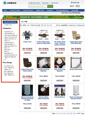
This section documents the different configs available to enable you to configure the number of products shown in a page.
You can configure the number of products to be shown per page using the “pageSize” config
pageSize:
|
Data type |
number |
Required |
True (only when select page size section is available on the web) |
|
Default value |
12 |
||
|
Description |
Configure the number of products to be shown in a page |
||
|
Sample values |
24 |
||
If you want to show page size on your webpage, you must also provide the CSS selector for the container element using the “pageSizeContainerSelector” config
pageSizeContainerSelector:
|
Data type |
string |
Required |
True (when pagesize section is enabled) |
|
Default Value |
NA |
||
|
Description |
CSS selector of the page size container element on the page |
||
|
Sample values |
#results_pagesize |
||
You can configure the page size options to be shown using the “pageSizeOptions” config.
pageSizeOptions:
|
Data type |
array |
Required |
True (when pagesize section is enabled) |
|
Default Value |
[{ name: ’12’, value: ’12’ }, { name: ’24’, value: ’24’ }] |
||
|
Description |
The list of page size options to be shown Note: Unbxd has a maximum limit of 99 products per api call. |
||
|
Sample values |
[ { name: ’48 item’, value: ’48’ }, { name: ’72 items’, value: ’72’ }, { name: ’96 items’, value: ’96’ } ] |
||
Configure whether you want the page size options to show up as a list in a dropdown or as individual clickable items using the “pageSizeContainerType” config.
pageSizeContainerType:
|
Data type |
string |
Required |
True (when pagesize section is enabled) |
|
Default Value |
select |
||
|
Description |
Used to indicate if the selecting a page size option is by click or selecting from dropdown |
||
|
Accepted Values |
click (or) select click -> when the page size section is styled as an anchor or any other clickable element select -> When the page size section is styled using a select element. |
||
You can further customize the page size render behaviour by providing a handlebars template for the same using the “pageSizeContainerTemp” config
pageSizeContainerTemp:
|
Data type |
string |
Required |
True (when pagesize section is enabled) |
|
Default value |
[ ‘<select>’, ‘{{#options}}’, ‘{{#if selected}}’, ‘<option value=”{{value}}” selected unbxdpageSize=”{{value}}”>{{name}}</option>’, ‘{{else}}’, ‘<option value=”{{value}}” unbxdpageSize=”{{value}}”>{{name}}</option>’, ‘{{/if}}’, ‘{{/options}}’, ‘</select>’ ].join(”) |
||
|
Description |
String representation of the HTML schema on how the page size section to be rendered *inputdata -> { options: [{name: “48 item”, value: “48”, selected: true} {name: “72 items”, value: “72”, selected: false} {name: “96 items”, value: “96”, selected: false} ] } |
||
|
Sample values |
<span class=”ae-label” id=”unbxd-pageview-labelledby”>Show: </span> <select aria-labelledby=”unbxd-pageview-labelledby” data-ae-blurbtype=”select” data-ae-form-field=”true”> {{#options}} <option {{#if selected}}selected=”selected” {{/if}} unbxdpagesize=”{{value}}”> {{name}}</option> {{/options}} </select> |
||
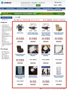
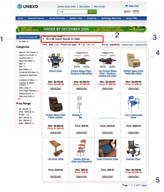
To view the description of the labels in the screenshot above, refer to the table below.
| Label | Description |
|---|---|
| ID | Indicates the unique identifier of the record |
| Store View | Indicates the store related to upload operation |
| Created | Indicates the calendar date and time the specific upload queue entry was created |
| Finished | Indicates the upload end time of the catalog |
| Execution Time(s) | Indicates the duration of time (in seconds) the upload took to complete |
| Affected Entities | Indicates the total number of products affected by the feed upload |
| Number of Entities | Indicates the total number of entities in the upload process |
| Operation Type |
Indicates the status of a feed upload operation
|
| Additional Information | Indicates the information related to reindexing |
| Action |
Indicates the action available for the specific entity
|
| Clear Feed View | Allows you clear the Feed View queue |
| View Log | Allows you to view the log file entries for the entire cron job. You can also download the log file, refresh the log entries, and clear the log |
| Actions | Allows you to delete feed upload for multiple entities |
| Filters | Allows you to create filters to refine the Feed View table |
| Default View | Allows you to reset the Feed View table to its original settings |
| Columns | Allows you to select the columns you want displayed in the Feed View table |
| Log Viewer |
Provides some operations with log file:
|
 You cannot delete an entity when the upload is ‘Running’
This section documents the different configs that can be used to configure the different views for displaying the products
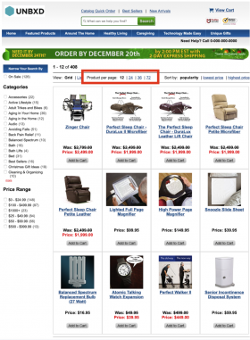
In such cases, the context-aware algorithm of Unbxd understands your visitor’s intent and sends a “Did You Mean” response along with a search result set for the query, if any.
This section documents the different properties to be configured to show “Did you mean?” spell check section on your webpage
For this, provide the CSS selector for the container element using the “spellCheck” config.
spellCheck:
|
Data type |
String |
|
Required |
false |
|
Default Value |
NA |
|
Description |
CSS selector to identify the did you mention section on the page |
|
Sample values |
#did_you_mean |
You can further customize the spell check render behaviour by providing a handlebars template for the same using the “spellCheckTemp” config
spellCheckTemp:
|
Data type |
String |
|
Required |
True |
|
Default Value |
‘<h3>Did you mean : {{suggestion}}</h3>’ |
|
Description |
String representing the html scheme for did you mean section using handlebars template syntax *input data -> { suggestion: “shoes” numberOfProducts: 0 } |
|
Sample values |
<span class=”base” data-ui-id=”page-title-wrapper”>Did you mean <span class=”bold”>{{suggestion}}</span> ?</span> </h1> |
Displays the ‘query name’ while searching for the relevant products.
This section documents the different configs that can be used to show the searched query on your webpage
For this, provide the CSS selector for the container element using the “searchQueryDisplay” config
searchQueryDisplay:
|
Data type |
String |
|
Required |
True |
|
Default Value |
‘NA |
|
Description |
CSS selector to identify the search results message section on the page |
|
Sample values |
#search_result_display |
You can further customize the search query message render behaviour by providing a handlebars template for the same using the “searchQueryDisplayTemp” config
searchQueryDisplayTemp:
|
Data type |
String |
|
Required |
True |
|
Default Value |
<h3>Search results for {{query}} – {{numberOfProducts}}</h3> |
|
Description |
String representing the html scheme for search message section using handlebar template syntax |
|
Sample values |
*input data -> { numberOfProducts: 79816 start: 1 end: 48 query: “*” } <span class=”base” data-ui-id=”page-title-wrapper”>Did you mean <span class=”bold”>{{suggestion}}</span> ?</span> </h1> |
The following table summarises the various properties which can be passed as search options while invoking the “setSearch” function in “Unbxd” object.
|
function |
Javascript function used to evaluate the category id (or) path for the page to be loaded.This function is applicable only when the “type” attribute in search options is “category” |
if (“page_type” in window.UnbxdAnalyticsConf && window.UnbxdAnalyticsConf.page_type == ‘CATEGORY’) { if (“page_id” in window.UnbxdAnalyticsConf) { return ‘categoryPathId:”‘ + window.UnbxdAnalyticsConf[“page_id”] + ‘”‘; } else { return ‘categoryPath:”‘ + window.UnbxdAnalyticsConf[“page”] + ‘”‘; } } |
|
|
deferInitRender |
array |
||
|
spellCheck |
string |
css selector to identify the did you mention section on the page |
#did_you_mean |
|
spellCheckTemp |
string |
String representing the html scheme for did you mean section using handlebars template syntax *input data -> { suggestion: “shoes” numberOfProducts: 0 } |
Did you mean {{suggestion}} ? |
|
searchQueryDisplay |
string |
Css selector to identify the search results message section on the page |
#search_result_display |
|
searchQueryDisplayTemp |
string |
String representing the html scheme for search message section using handle template syntax *input data -> { numberOfProducts: 79816 start: 1 end: 48 query: “*” } |
Search results {{#isNotEmptySearch query}}for: {{query}} ({{start}} – {{end}} of {{numberOfProducts}} products){{/isNotEmptySearch}} |
|
searchResultContainer |
string |
Css selector representing the product results container in the page |
#results-container |
|
searchResultSetTemp |
string|function |
String representing the html scheme for displaying the products in the results container *input data -> {numberOfProducts: 5361 start: 0 products: [ { productUrl: “/shop/prod/mens-spring-step-casual-shoes/423424.htm” was_price_min: 69.95 title: “Mens Spring Step Casual Shoes” was_price_max: 69.95 uniqueId: “ZTZ47C” price_max: 69.95 brand: [“Spring Step”] price_min: 69.95 more_colors_available: “true” imageUrl: [“/images/store/product/images/563794479patrick.jpg”] variantTotal: 5 score: 0.4200723 relevantDocument: “parent” variantCount: 5 unbxdprank: 1 }] unbxdparam_requestId: null } Or a javascript function , where the data above will be passed as an input argument and the function should handle the dynamic binding of the html section |
{{#products}} unbxdparam_title=”{{ItemName}}” unbxdattr=”product” unbxdparam_sku=”{{uniqueId}}” unbxdparam_prank=”{{unbxdprank}}”>
itemscope=”” itemprop=”offers”> Price: <span class=”dollar”>%%EDITORCONTENT%%lt;/span>{{price_min}} – ${{price_max}}
{{title}}
src/store/content/bazaarVoice/images/{{no_of_stars}}.gif” alt=”{{no_of_stars}} star rating”> ({{getReviewCount}} review)
{{description}}
{{/products}} |
|
isAutoScroll |
boolean |
Set it to true if you want autoscroll behaviour and no pagination on the site |
True *when set to true a value for attribute “heightDiffToTriggerNextPage” is mandatory |
|
heightDiffToTriggerNextPage |
number |
Numeric representation of pixels from bottom of the page before which pagination should kick in |
250 When set to 250 when the scroll position has reached less than 250 px to the bottom of the page, the next set of results will be loaded |
|
isClickNScroll |
boolean |
Set this to true if you want to simulate a load more results behaviour instead of having autoscroll or paginated links |
true |
|
clickNScrollElementSelector |
string |
Css selector match the button or link which would trigger the load more action |
#load-more-results |
|
isPagination |
boolean |
Set it to true if you need a traditional paginated links for previous and next pages |
True * when autoscroll and pagination is set to true than autoscroll takes precedence |
|
setPagination |
function |
Post results processing hook to extend custom behaviour. It is a function with three arguments. |
Arguments to the function 1.Integer (total number of pages) 2. Integer (no of products per page) 3. Integer (current page number) |
|
paginationContainerSelector |
string |
css selector used to match the pagination section on the page. |
.page-nav-section |
|
paginationTemp |
string |
String representing the htm scheme for pagination section on the page *Input data -> { hasFirst: false hasPrev: false pages: (2) [{…}, {…}] totalPages: 112 hasNext: true hasLast: true productResultCount: 5361 } |
{{#if hasPrev}} Previous<span class=”seperator”>| {{/if}} Page {{#pages}} {{#if current}} {{page}} {{else}} {{#unbxdIf page ../startPage}} {{#if ../hasFirst}} {{else}} {{/if}} {{else}} {{#unbxdIf page ../endPage}} {{#if ../hasLast}} {{else}} {{/if}} {{else}} {{/unbxdIf}} {{/unbxdIf}} {{/if}} {{/pages}} of {{totalPages}} {{#if hasNext}} |Next {{/if}} |
|
facetMultiSelect |
boolean |
Set to true if you facets which can be multi selected |
true |
|
facetContainerSelector |
string |
Css selector matching the section which should contain the facets for the search results |
#facets_container |
|
facetCheckBoxSelector |
string |
If there are checkboxes used to filter the facet values, then the css selector which would apply to all such checkbox input elements |
#facets_container .facet_value input[type=checkbox] |
|
selectedFacetTemp |
string |
String representation of the html schema to display the applied filters *input data -> { filters: [ {fcode: “Collection”, value: “Sherpa”, fsysname: “collection_uFilter”} ], ranges:[] } |
{{#filters}}
{{value}} data-ae-blurbtype=”button” class=”ae-img unbxd-remove-item” unbxdParam_facetName=”{{fsysname}}” unbxdParam_facetValue=”{{value}}”> {{/filters}}
|
|
selectedFacetContainerSelector |
string |
Css selector match the selected facet section on the page |
#applied-filter-section |
|
facetMultilevel |
boolean |
Set to true for multilevel facets |
true |
|
facetMultilevelName |
string |
The field name of the multi level facet field |
CATEGORY |
|
clearSelectedFacetsSelector |
string |
Css selector matching clear all link to remove all applied filters on the page |
#clear-all-filters |
|
removeSelectedFacetSelector |
string |
Css selector match the individual reset filters links in the selected facet section |
.unbxd-remove-item |
|
loaderSelector |
string |
Css selector used to find the loader gif/image to indicate async loading of results |
#loader-icon |
|
onFacetLoad |
function |
call back function which would be invoked after painting of facets on the page. This function can be used to scroll the page to top on completion of loading, bind additional event handlers if custom accordion implementation is required Function with one argument of type object which carriers information about the facets displayed. |
function (obj) { if (this.facetScrollTop) { jQuery(“html, body”).animate({ scrollTop: 0 }, 300); this.facetScrollTop = false; } } |
|
onIntialResultLoad |
function |
Call back function invoked when the unbxd page binding happens for the first time. Function with one argument of type object which carriers the entire result set including products and facets Can be used to trigger analytics event adjust product container height etc. |
function (obj) { var pids_list = []; for (var i = 0; i < obj[‘response’][‘products’].length; i++) { var prd = obj[‘response’][‘products’][i]; var sku = prd[‘uniqueId’] pids_list.push(sku.replace(/\./g, “”)); } var impressionObj = { query: obj[‘searchMetaData’][‘queryParams’][‘q’], pids_list: pids_list }; Unbxd.track(impressionObj, ‘search_impression’); } |
|
onPageLoad |
function |
Call back function invoked every time when the page content is refreshed after initial load (like applying sort options, changing page size, paginating through the results Function with one argument of type object which carriers the entire result set including products and facets Can be used to trigger analytics event adjust product container height etc. |
function (obj) { var pids_list = []; for (var i = 0; i < obj[‘response’][‘products’].length; i++) { var prd = obj[‘response’][‘products’][i]; var sku = prd[‘uniqueId’] pids_list.push(sku.replace(/\./g, “”)); } var impressionObj = { query: obj[‘searchMetaData’][‘queryParams’][‘q’], pids_list: pids_list }; Unbxd.track(impressionObj, ‘search_impression’); } |
|
sanitizeQueryString |
function |
Call back function used to sanitize the search query to handle special case as per customer requirement Function with one argument of type string which would hold the value of the searched query term |
function (q) { return q.trim();; }
|
|
getFacetStats |
string |
Representing the variable name in the stats object which will hold the min and max values for range facet |
“facetstats” |
|
processFacetStats |
function |
Function used to leverage the max and min values of range facets to implement slider behaviour Function with one argument of type object which would hold all facet information |
function (obj) { // any logic within }, |
|
setDefaultFilters |
function |
This function will be invoked on every data fetch call from unbxd search engine. Hence can be used to apply default filters like show only instock products. |
function () { this.addFilter(“stock_availability”,”In Stock”); } |
|
fields |
array |
List of product attribute name which should be fetched for matching products
|
[‘title’, ‘unbxd_title’, ‘price’, ‘image_url’, ‘productUrl’, ‘doctype’, ‘saleprice’, ‘desktop_url’, ‘mobile_url’, ‘average_rating’, ‘min_price’, ‘max_price’, ‘price’, ‘sash_css_class’, ‘v_image_url’, ‘brand’ ] |
|
onNoResult |
function |
This function is invoked when there are no matching products for the search term queried by the user It is a function with one argument of type object which holds the result set including search term. |
function(obj){ this.compiledNoResultsTemp = Handlebars.compile(this.options.onNoResultTemp); jQuery(“#no-results-section”).html(this.compiledNoResultsTemp({ query: obj.searchMetaData.queryParams.q }));
} |
|
noEncoding |
boolean |
Set to true if you want to enable encoding of url params and subsequent decoding |
|
|
customReset |
function |
This function is called when sorting the results, changing the view or resetting all filter options No argument function used as a extension point for custom behaviour |
function (){ } |
|
bannerSelector |
string |
Css selector matching the merchandising banner slot on the page |
#up-sell-banner-section |
|
bannerTemp |
string |
String representation of the HTMl Schema used to apply promotional banner on the page *input data -> { landingUrl:””, imageUrl:”” } |
|
|
bannerCount |
number |
Integer representation of the number of banners which should be displayed on the page |
2 |
|
sortContainerSelector |
string |
Css selector matching the sort section on the page |
#sort-section |
|
sortOptions |
array |
Can configure the sort options to be displayed on the page |
[{ name: ‘Popularity’ }, { name: ‘Low to High Price’, field: ‘price_min’, order: ‘asc’ }, { name: ‘High to Low Price’, field: ‘price_max’, order: ‘desc’ } } ] |
|
sortContainerType |
string |
Used to indicate if the selecting a sort option are by click or selecting from dropdown |
click (or) select |
|
sortContainerTemp |
string |
String representation of the HTML schema on how the sort section to be rendered *input data -> { options: [{name: “Popularity”, selected: true} {name: “Low to High Price”, field: “price_min”, friendlyUrlText: “price-low”, order: “asc”, selected: false} {name: “High to Low Price”, field: “price_max”, friendlyUrlText: “price-high”, order: “desc”, selected: false} {name: “Newest First”, field: “published_date”, friendlyUrlText: “newest”, order: “desc”, selected: false} {name: “Top Rated”, field: “no_of_stars”, friendlyUrlText: “ratings”, order: “desc”, selected: false} ] } |
Search results {{#isNotEmptySearch query}}for: {{query}} ({{start}} – {{end}} of {{numberOfProducts}} products){{/isNotEmptySearch}}
Sort By:
{{#options}}
{{name}} {{/options}}
|
|
pageSize |
number |
Configure the number of products to be shown in a page |
24 |
|
pageSizeContainerSelector |
string |
Css selector matching the page size section on the page |
#results-pagesize |
|
pageSizeOptions |
array |
The possible list of page view option to be shown on the web *note unbxd has a maximum limit of 99 products per api call. |
[ { name: ’48 item’, value: ’48’ }, { name: ’72 items’, value: ’72’ }, { name: ’96 items’, value: ’96’ } ] |
|
pageSizeContainerType |
string |
Used to indicate if the selecting a page size option is by click or selecting from dropdown |
click (or) select |
|
pageSizeContainerTemp |
string |
String representation of the HTML schema on how the page size section to be rendered *inputdata -> { options: [{name: “48 item”, value: “48”, selected: true} {name: “72 items”, value: “72”, selected: false} {name: “96 items”, value: “96”, selected: false} ] } |
Show:
data-ae-form-field=”true”> {{#options}}
{{name}} {{/options}}
|
|
viewTypeContainerTemp |
string |
String representation of the HTML schema on how the page view section to be rendered *inputdata -> { options: [{name: “Grid”, value: “grid”, selected: true} {name: “List”, value: “list”, selected: false} ] } |
View: {{#options}} {{/options}} |
|
viewTypeContainerSelector |
string |
Css selector matching the page view section on the page |
#results-pageview |
|
viewTypes |
array |
Indicates all different views available on the page |
*If the customer only have grid view then [‘grid’] *If the customer only have list view then [‘list’] *If customer has both views then [“list”,”grid”] |
|
variants |
boolean |
Pass true to display variants |
true |
|
variantsCount |
number |
Pass the number of variants to be shown for a product |
3 |
|
isSwatches |
boolean |
Pass true to display swatches |
true |
|
swatchesSelector |
string |
CSS selector of the swatches element |
.swatch-box |
|
mappedFields |
object |
Pass the field names for the important product attributes that you want to render |
{ “imageUrl”: “imageUrl”, “productUrl”: “productUrl”, “title”: “title”, “description”: “description”, “price”: “price”, “categoryPath”: “categoryPath”, “variantFields”: { “imageUrl”: “v_imageUrl”, “productUrl”: “v_productUrl”, “title”: “v_title”, “price”: “v_price”, “groupBy”: “variant_color”, “swatchFields”: { “swatch_background_image”: “variant_overhead_swatch”, “swatch_background_color”: “variant_color”, “swatch_click_image”: “variant_image_array” } } } |
|
retainbaseParam |
boolean |
||
|
baseParams |
array |
||
|
requestHeaders |
object |
Request headers if any to be sent on unbxd search response |
- Did this answer your question?

