- ProductsSearch and BrowseRecommendationsCustomer Engagement
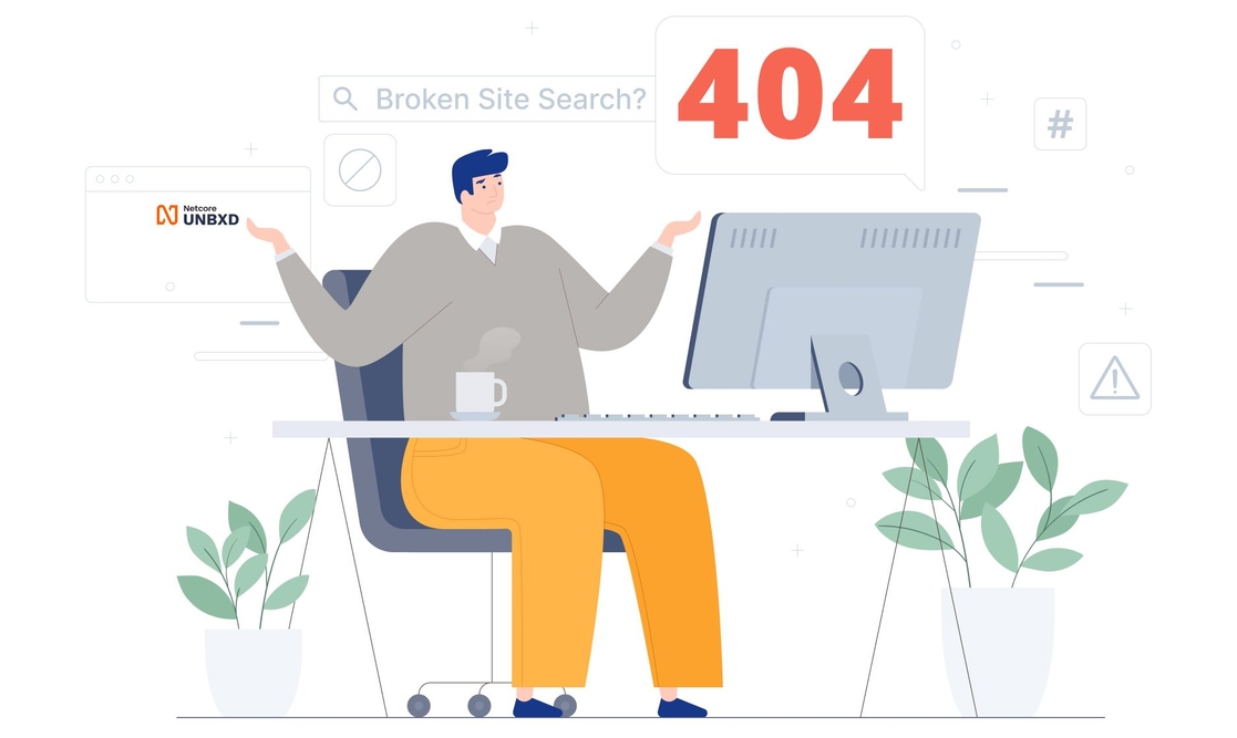
Broken site search? Quick ways to fix it!

Did you know that 8 out of 10 Americans shop online? About 79% of U.S. shoppers find what they want and order it via the Internet. Despite this, 42% of companies completely ignore the on-site search.
Looking at the stats, we realize how deeply we are engaged with online shopping and how some companies still don’t prioritize fixing a broken search system.
Let’s consider the upcoming holiday season. This is the time of the year when merchandisers, both online and offline, put together their holiday catalogs for shoppers to splurge on. But what will happen if your site search is broken and shoppers leave your site to fulfill their product needs elsewhere? How will your shoppers know you have what they want? First, you wouldn’t want to lose your business to the competition. Right?
So, making sure that the shoppers find exactly what they are looking for has to be your #1 priority. A broken site search would mean your shoppers could not ‘discover’ their favorite product or even buy it. Who would like that?
I wouldn’t. I’d probably strike that site off my future references and look elsewhere for the same brand/product. And that is why you would want your search engine to work just fine for the shoppers who come to your site to check items off their lengthy shopping list for a holiday or else brace yourself for:
Broken Site Search = Lost Customers = Plunging Sales = Lost Revenues.
##3 What are some of the major problems?

A reliable search engine must be able to relate to and understand shoppers' needs just as humans (who listen) would do! For example, imagine Rick looking for a 'red Santa hat,' defined as a 'red floppy hat' within your product catalog. Just because Rick searches for the product by a different name, it shows him "zero results." Should that even happen? No, right?
So, suppose your site's search engine overcomes these trivial problems and becomes capable of identifying synonyms, searching for similar words, and auto-correcting queries for product names. In that case, customers like Rick will never face the 'Zero Results' page. Revenues will increase, shoppers won't leave, ROI value will increase, and your customers will appreciate your efforts to provide seamless search result
Why should you fix it?
Ecommerce sites get into trouble when they do not offer shoppers what they want. Like shoppers search for a product, their queries don't fetch product suggestions, aren't corrected for typos, and results aren't filtered for relevance. Unfortunately, this is a scenario that most ecommerce websites face!
Do we ever realize why merchandisers like you prefer selling their products on Amazon over any other site? It is because you know shoppers will be able to search for and find your product easily if you market it well on Amazon. This is made possible only because of Amazon's robust search engine. When shoppers search for a product, powerful algorithms work behind the scenes to display the most relevant results. This makes it easier for merchants and merchandisers, large and small, to reach customers beyond geography. Therefore, a flawed search system must be fixed to overcome its hazards.
How to solve for a bad site search?
Typical eCommerce metrics such as "Abandonment Rate," "Conversion Rate," "Click-Through Rates," and "Zero Queries" have a lasting effect on the site's performance. It is the job of a Search Quality Analyst to bridge this gap. Unbxd takes that role perfectly and builds your site's search engine effectively.
"You can't look at the competition and say you're going to do it better. You have to look at the competition and say you're going to do it differently." – Steve Jobs.
So, find different approaches to fix your site search. We have curated six ways for you to fix it by yourself when nothing else works:
List it right
An appropriately structured Product Listing Page (PLP) helps shoppers navigate product categories without getting lost in a maze of choices. Perform a rigorous card sorting exercise to ensure products are categorized well and sorted nicely. A lot of times, shoppers exit a site in frustration when they can't find the right products within a category. Similarly, ensure your Product Listing Page (PLP) lists products by relevance to fit your shoppers' needs perfectly. Your shoppers should be able to spot the product they want on a visually appealing results page.
All that glitters is gold
We are all visual beings. Shoppers like to see high-resolution images of the products they want to buy. Pictures are the only way a shopper feels as if they are in the store itself. The description, besides amazing pictures, is extremely important so shoppers can understand the specifications, features, and pros/cons. A well-balanced mix of textual and visual content in stores entices shoppers to return and spend more.
Remember this device
Studies show that 40% of online shoppers use their mobile phones to shop. You must always know your audience and show them the list of products in a visually enhanced manner. Customers can interact with the products as if they were shopping offline. The design of your website and app plays a vital role in making shoppers believe in online shopping! So, always remember their device!
Declutter your catalog
Chances are that your catalog has hundreds or millions of products. This means you must structure your catalog and index the products in a suitable format when uploading them to your store's database. The right format means indexing the product feed, and removing products that aren't part of your business vertical, are temporarily out of stock, or are simply not sold anymore.
Detangle checkout
Once shoppers find the product they want, they want to buy it quickly and easily. Of course, this is easier said than done. Shoppers appreciate it when the checkout process doesn't have multiple complex steps to complete the payment. All that remains is to complete the payment and wait for delivery. If the end process takes time, they will surely run out of time and take their business elsewhere.
Pay as you like it
Shoppers like the luxury of choosing the most convenient mode of payment. So allow them to choose between Credit or Debit cards, mobile wallets, net banking options, various payment gateways, and more. This diversifies your payment options and enhances your shoppers' user experience.
Let's revisit someone who was shopping for the perfect wedding ring. He could have just got the ring he was looking for. However, if your Product Display Page wasn't categorized correctly, he would have 'bounced' out of there before even saying 'I Do.'
Thankfully, creating an intuitive search engine is easy peasy with Unbxd's proprietary search system. Once you've integrated our search engine, shoppers like Ken find exactly what they are looking for and more. How? Give your shoppers options, give them filters, and recommendations, power their search with versatile auto-suggest options, filter out the noise, display search results by relevance, and voila! Your loyal customers become your biggest advocates. And also, fix these six things about your site with us, and you'll see your site's performance improving, your shoppers' sticking' with your brand, and revenues increasing.
Make sure you take advantage of this holiday season and double your conversion rate instead! The verdict is clear: Leave search broken as it is; you'll have disappointed shoppers leaving by the scores. Book a demo, and we'll show you how you can get a 10% uplift in your revenue.


